 |
The upper-case 'Q' tail touches the circle.
|
 |
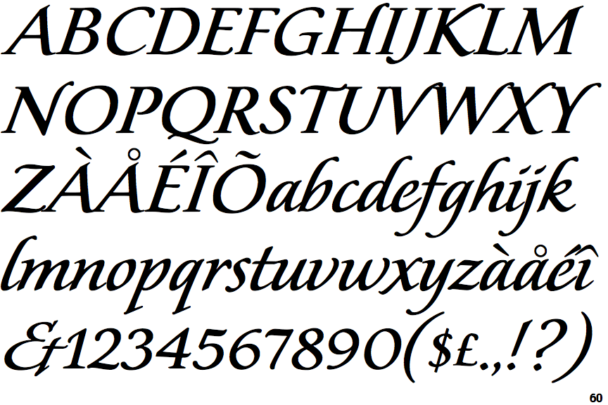
The '&' (ampersand) looks like 'Et' with a gap at the top.
|
 |
The characters have serifs.
|
 |
The centre bar of the upper-case 'P' leaves a gap with the vertical.
|
 |
The upper-case 'U' has no stem/serif.
|
 |
The upper-case 'Y' arms and tail are separate strokes.
|
 |
The centre bar of the upper-case 'R' meets the vertical.
|
 |
The upper-case 'I' is a single stroke with serifs.
|
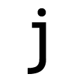 |
The tail of the lower-case 'j' is curved with an upper serif.
|
Note that the fonts in the icons shown above represent general examples, not necessarily the two fonts chosen for comparison.
Show Examples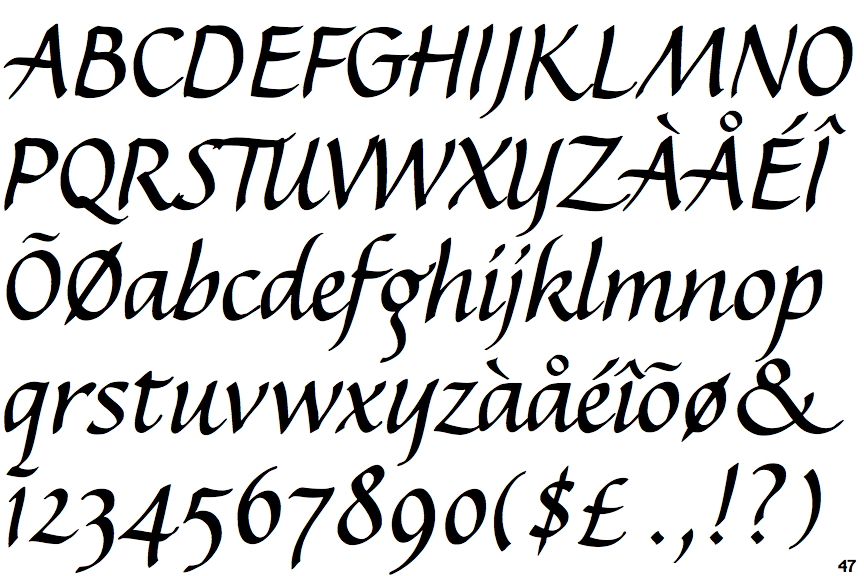
 |
The upper-case 'Q' tail crosses the circle.
|
 |
The '&' (ampersand) is traditional style with two enclosed loops.
|
 |
The characters do not have serifs.
|
 |
The centre bar of the upper-case 'P' meets the vertical.
|
 |
The upper-case 'U' has a stem/serif.
|
 |
The upper-case 'Y' right-hand arm forms a continuous stroke with the tail.
|
 |
The centre bar of the upper-case 'R' leaves a gap with the vertical.
|
 |
The upper-case 'I' is a single stroke with no serifs.
|
 |
The tail of the lower-case 'j' is curved with no upper serif.
|