Identifont

Fonts by Appearance

Fonts by Name

Fonts by Similarity

Fonts by Picture

Fonts by Designer/Publisher

Differences

TweetTweet Differences

Compare: and  

Filosofia

Filosofia

Serif
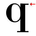
The top of the lower-case 'q' has a right-facing serif.
Downward
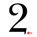
The base of the '2' has a downward-pointing serif.

Note that the fonts in the icons shown above represent general examples, not necessarily the two fonts chosen for comparison.

Show Examples
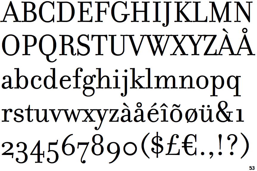
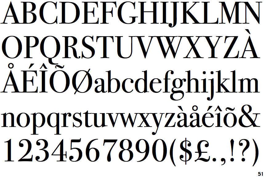
ITC Bodoni Seventy-Two

ITC Bodoni Seventy-Two

Spur
The top of the lower-case 'q' has a vertical or slightly angled spur (pointed or flat).
Upward
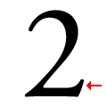
The base of the '2' has an upward-pointing serif.