Differences
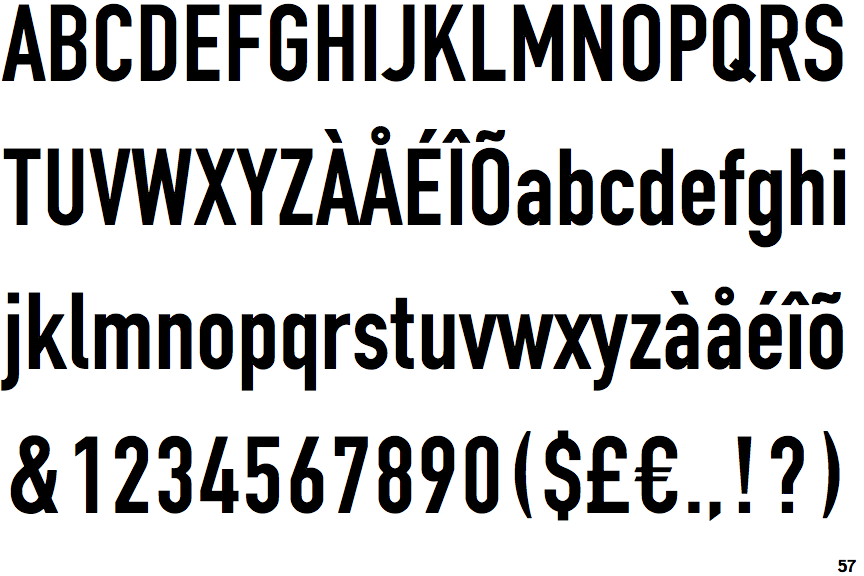
Fette Engschrift
 |
The '$' (dollar) has a single line which does not cross the 'S'.
|
 |
The '4' is open.
|
 |
The centre vertex of the upper-case 'M' is above the baseline.
|
 |
The upper-case 'G' has no spur/tail.
|
 |
The 'l' (lower-case 'L') has a right-facing lower serif or tail.
|
 |
The leg of the upper-case 'R' is straight.
|
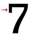 |
The top of the '7' has a downward-pointing serif or bar.
|
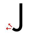 |
The tail of the upper-case 'J' points horizontally or slightly upwards.
|
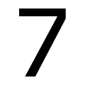 |
The stem of the '7' is straight.
|
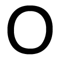 |
The upper-case letter 'O' is taller than it is wide.
|
There are more than ten differences; only the first ten are shown.
Note that the fonts in the icons shown above represent general examples, not necessarily the two fonts chosen for comparison.
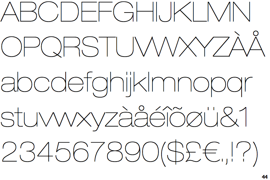
Show ExamplesNeue Helvetica Extended Ultra Light
 |
The '$' (dollar) has a single line crossing the 'S'.
|
 |
The '4' is closed.
|
 |
The centre vertex of the upper-case 'M' is on the baseline.
|
 |
The upper-case 'G' has a spur/tail.
|
 |
The 'l' (lower-case 'L') has no serifs or tail.
|
 |
The leg of the upper-case 'R' is curved outwards.
|
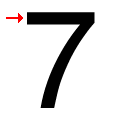 |
The top of the '7' has no serif or bar.
|
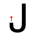 |
The tail of the upper-case 'J' points vertically.
|
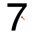 |
The stem of the '7' is curved inwards.
|
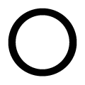 |
The upper-case letter 'O' is circular or equal proportions.
|
