 |
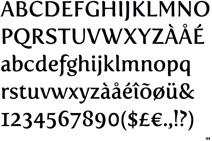
The centre vertex of the upper-case 'M' is above the baseline.
|
 |
The verticals of the upper-case 'M' are parallel.
|
 |
The 'l' (lower-case 'L') has a right-facing lower serif or tail.
|
 |
The centre bar of the upper-case 'R' meets the vertical.
|
 |
The lower-case 'e' has a curved bar with no straight segment.
|
 |
The lower storey of the lower-case 'g' has a gap.
|
 |
The '1' (digit one) has double-sided base or serifs.
|
 |
The lower-case 'i' has a right-facing lower serif or tail.
|
 |
The tail of the lower-case 'f' descends below the baseline.
|
 |
The centre strokes of the upper-case 'W' meet in a T on the left.
|
Note that the fonts in the icons shown above represent general examples, not necessarily the two fonts chosen for comparison.
Show Examples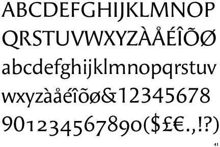
|
The centre vertex of the upper-case 'M' is on the baseline.
|
 |
The verticals of the upper-case 'M' are sloping.
|
 |
The 'l' (lower-case 'L') has no serifs or tail.
|
 |
The centre bar of the upper-case 'R' leaves a gap with the vertical.
|
 |
The lower-case 'e' has a straight horizontal bar.
|
 |
The lower storey of the lower-case 'g' has no gap.
|
 |
The '1' (digit one) has no base.
|
 |
The lower-case 'i' has no serifs or tail.
|
 |
The tail of the lower-case 'f' sits on the baseline.
|
 |
The centre strokes of the upper-case 'W' meet at a vertex.
|