Differences
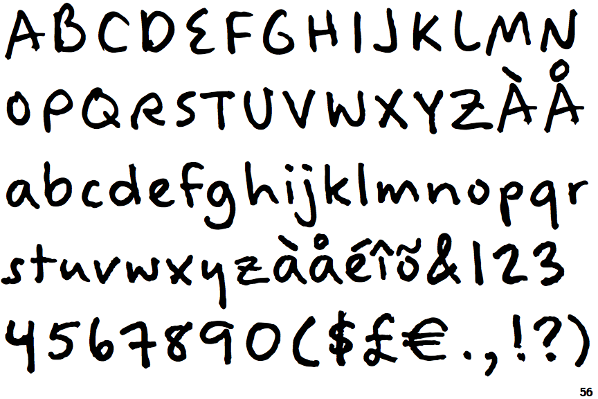
Felt Tip Woman
 |
The lower-case 'a' stem stops at the top of the bowl (single storey).
|
 |
The upper-case 'G' has a bar to the left.
|
 |
The upper-case 'Y' arms and tail are separate strokes.
|
 |
The upper-case 'J' has no bar.
|
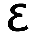 |
The upper-case 'E' is drawn as a single stroke (with or without loop).
|
 |
The centre bar of the upper-case 'R' leaves a gap with the vertical.
|
 |
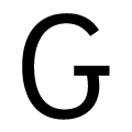
The right side of the upper-case 'G' is curved.
|
 |
The lower-case 'u' has a stem/serif.
|
 |
The upper-case letter 'I' is plain.
|
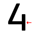 |
The bar of the '4' does not cross the vertical.
|
There are more than ten differences; only the first ten are shown.
Note that the fonts in the icons shown above represent general examples, not necessarily the two fonts chosen for comparison.
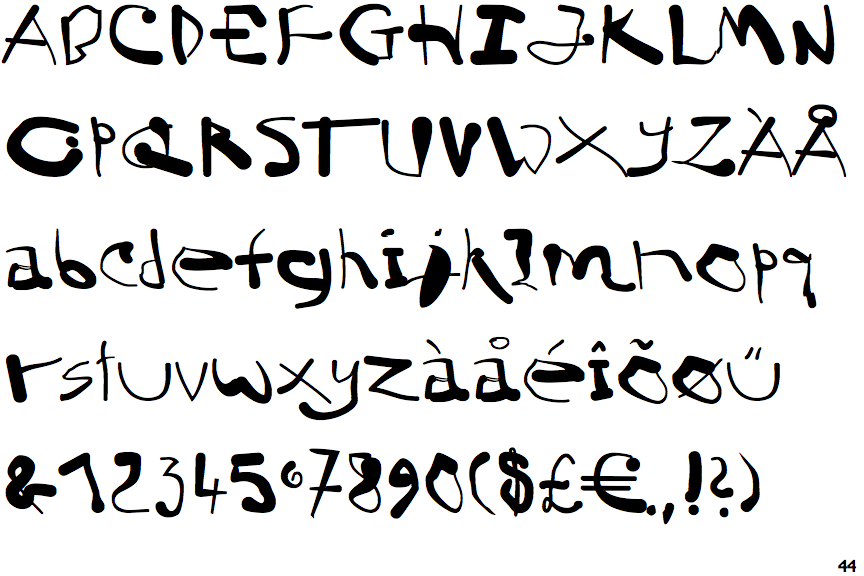
Show ExamplesEF Born Free Hungry
 |
The lower-case 'a' stem curves over the top of the bowl (double storey).
|
 |
The upper-case 'G' has double-sided bar.
|
 |
The upper-case 'Y' right-hand arm forms a continuous stroke with the tail.
|
 |
The upper-case 'J' has a bar to the left.
|
 |
The upper-case 'E' is normal letter shape.
|
 |
The centre bar of the upper-case 'R' meets the vertical.
|
 |
The right side of the upper-case 'G' has a flat section.
|
 |
The lower-case 'u' has no stem/serif.
|
 |
The upper-case letter 'I' has serifs/bars.
|
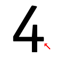 |
The bar of the '4' crosses the vertical.
|
