Differences
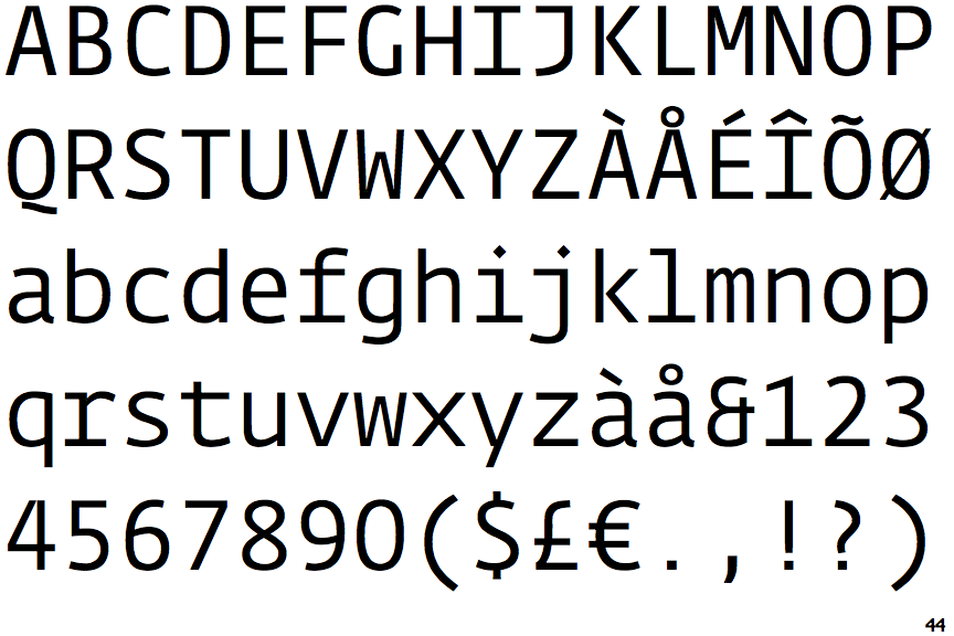
Fedra Mono
 |
The upper-case 'Q' tail is below and separated from the circle.
|
 |
The '$' (dollar) has a single line which does not cross the 'S'.
|
 |
The '&' (ampersand) looks like 'Et' with one enclosed loop (with or without exit stroke).
|
 |
The '4' is open.
|
 |
The verticals of the upper-case 'M' are parallel.
|
 |
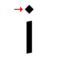
The dot on the lower-case 'i' or 'j' is diamond-shaped.
|
Note that the fonts in the icons shown above represent general examples, not necessarily the two fonts chosen for comparison.
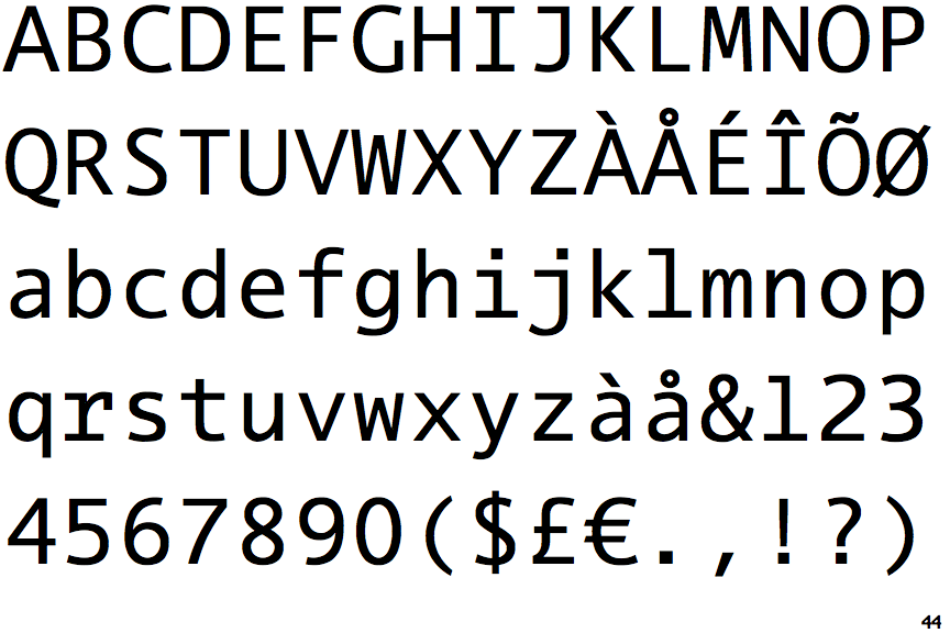
Show ExamplesEF Thordis Sans Mono
 |
The upper-case 'Q' tail touches the circle.
|
 |
The '$' (dollar) has a single line crossing the 'S'.
|
 |
The '&' (ampersand) is traditional style with two enclosed loops.
|
 |
The '4' is closed.
|
 |
The verticals of the upper-case 'M' are sloping.
|
 |
The dot on the lower-case 'i' or 'j' is square or rectangular.
|

