Identifont

Fonts by Appearance

Fonts by Name

Fonts by Similarity

Fonts by Picture

Fonts by Designer/Publisher

Differences

TweetTweet Differences

Compare: and  

Farnham Text

Farnham Text

Below
The upper-case 'J' descends below the baseline.
Bar
The diagonal strokes of the upper-case 'K' connect to the vertical via a horizontal bar.
Flat
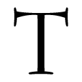
The top of the upper-case 'T' has a flat top.
Vertical
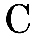
The top serif of the upper-case 'C' is vertical or nearly vertical.

Note that the fonts in the icons shown above represent general examples, not necessarily the two fonts chosen for comparison.

Show Examples
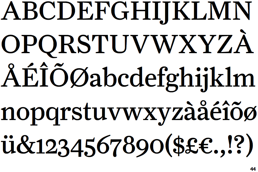
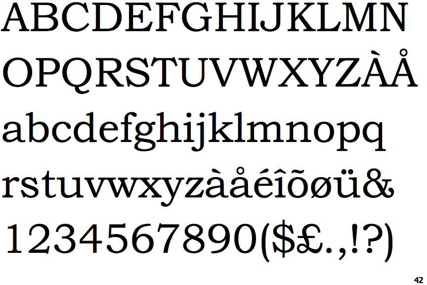
Bookman Old Style

Bookman Old Style

On
The upper-case 'J' sits on the baseline.
Double
The diagonal strokes of the upper-case 'K' meet in a 'T'.
Serifs
The top of the upper-case 'T' has upward-pointing serifs.
Left
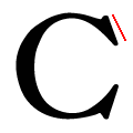
The top serif of the upper-case 'C' is angled left.