 |
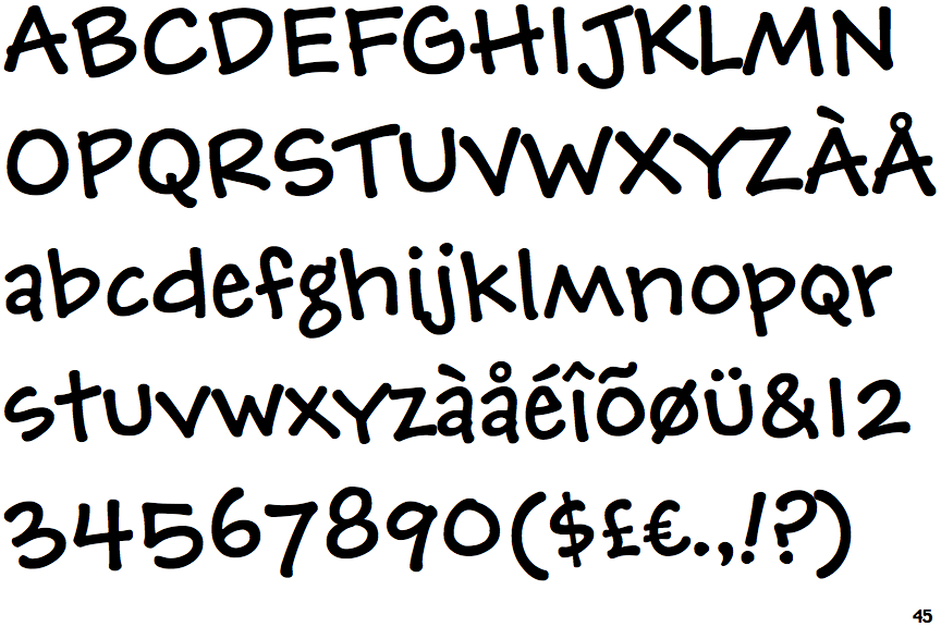
The upper-case 'J' descends below the baseline.
|
 |
The top storey of the '3' is a smooth curve.
|
 |
The lower-case 'g' is double-storey (with or without gap).
|
 |
The lower-case 'a' stem curves over the top of the bowl (double storey).
|
 |
The upper-case 'J' has a bar both sides.
|
 |
The centre bar of the upper-case 'R' meets the vertical.
|
 |
The upper-case letter 'I' is plain.
|
 |
The upper-case 'I' is a single stroke with no serifs.
|
Note that the fonts in the icons shown above represent general examples, not necessarily the two fonts chosen for comparison.
Show Examples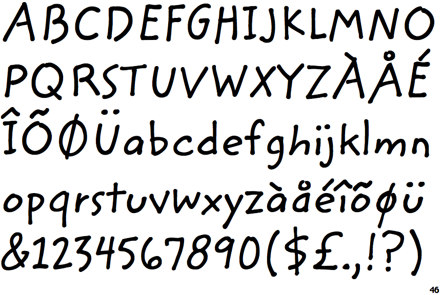
 |
The upper-case 'J' sits on the baseline.
|
 |
The top storey of the '3' is a sharp angle.
|
 |
The lower-case 'g' is single-storey (with or without loop).
|
 |
The lower-case 'a' stem stops at the top of the bowl (single storey).
|
 |
The upper-case 'J' has no bar.
|
 |
The centre bar of the upper-case 'R' leaves a gap with the vertical.
|
 |
The upper-case letter 'I' has serifs/bars.
|
 |
The upper-case 'I' is a single stroke with serifs.
|