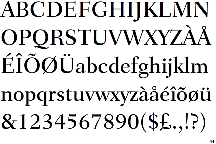
 |
The upper-case 'J' descends below the baseline.
|
 |
The diagonal strokes of the upper-case 'K' connect to the vertical via a horizontal bar.
|
 |
The top of the upper-case 'A' has no serifs or cusps.
|
 |
The upper-case 'G' foot has no spur or serif.
|
 |
The foot of the '4' has no serifs.
|
 |
The bar of the upper-case 'G' is double-sided.
|
 |
The lower storey of the lower-case 'g' has no gap.
|
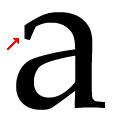 |
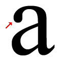
The loop of the lower-case 'a' has a flat end or cusp.
|
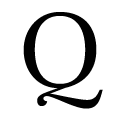 |
The tail of the upper-case 'Q' is Z-shaped.
|
 |
The foot of the '£' (pound) has no loop.
|
Note that the fonts in the icons shown above represent general examples, not necessarily the two fonts chosen for comparison.
Show Examples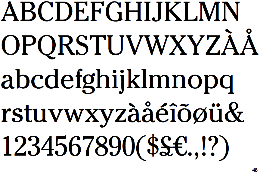
 |
The upper-case 'J' sits on the baseline.
|
 |
The diagonal strokes of the upper-case 'K' meet at the vertical (with or without a gap).
|
 |
The top of the upper-case 'A' has a serif or cusp on the left.
|
 |
The upper-case 'G' foot has a forward pointing spur or serif.
|
 |
The foot of the '4' has double-sided serifs.
|
 |
The bar of the upper-case 'G' is single-sided, left-facing.
|
 |
The lower storey of the lower-case 'g' has a gap.
|
 |
The loop of the lower-case 'a' has a ball or rounded end.
|
 |
The tail of the upper-case 'Q' is single-sided.
|
 |
The foot of the '£' (pound) has a loop.
|