 |
The '&' (ampersand) is traditional style with a gap at the top.
|
 |
The upper-case 'J' descends below the baseline.
|
 |
The dot on the '?' (question-mark) is circular or oval.
|
 |
The verticals of the upper-case 'M' are sloping.
|
 |
The upper-case 'G' has a bar to the left.
|
 |
The upper-case 'J' has a bar to the left.
|
 |
The upper-case letter 'I' has serifs/bars.
|
 |
The centre strokes of the upper-case 'W' meet at a vertex.
|
 |
The foot of the '£' (pound) has a loop.
|
Note that the fonts in the icons shown above represent general examples, not necessarily the two fonts chosen for comparison.
Show Examples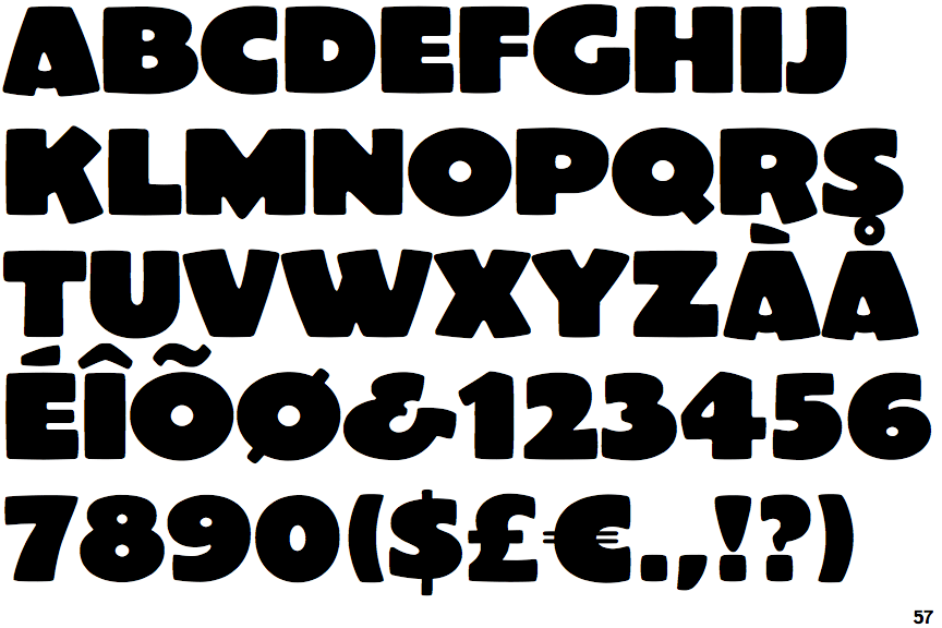
 |
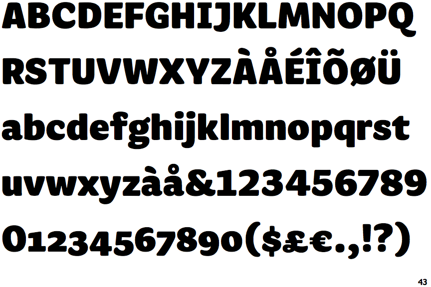
The '&' (ampersand) looks like 'Et' with a gap at the top.
|
 |
The upper-case 'J' sits on the baseline.
|
 |
The dot on the '?' (question-mark) is square or rectangular.
|
 |
The verticals of the upper-case 'M' are parallel.
|
 |
The upper-case 'G' has no bar.
|
 |
The upper-case 'J' has no bar.
|
 |
The upper-case letter 'I' is plain.
|
 |
The centre strokes of the upper-case 'W' meet in a T on the left.
|
 |
The foot of the '£' (pound) has no loop.
|