Identifont

Fonts by Appearance

Fonts by Name

Fonts by Similarity

Fonts by Picture

Fonts by Designer/Publisher

Differences

TweetTweet Differences

Compare: and  

FS Irwin Heavy

FS Irwin Heavy

Double
The diagonal strokes of the upper-case 'K' meet in a 'T'.
Double
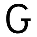
The upper-case 'G' has double-sided bar.
Right
The 'l' (lower-case 'L') has a right-facing lower serif or tail.
Vertex
The centre strokes of the upper-case 'W' meet at a vertex.

Note that the fonts in the icons shown above represent general examples, not necessarily the two fonts chosen for comparison.

Show Examples
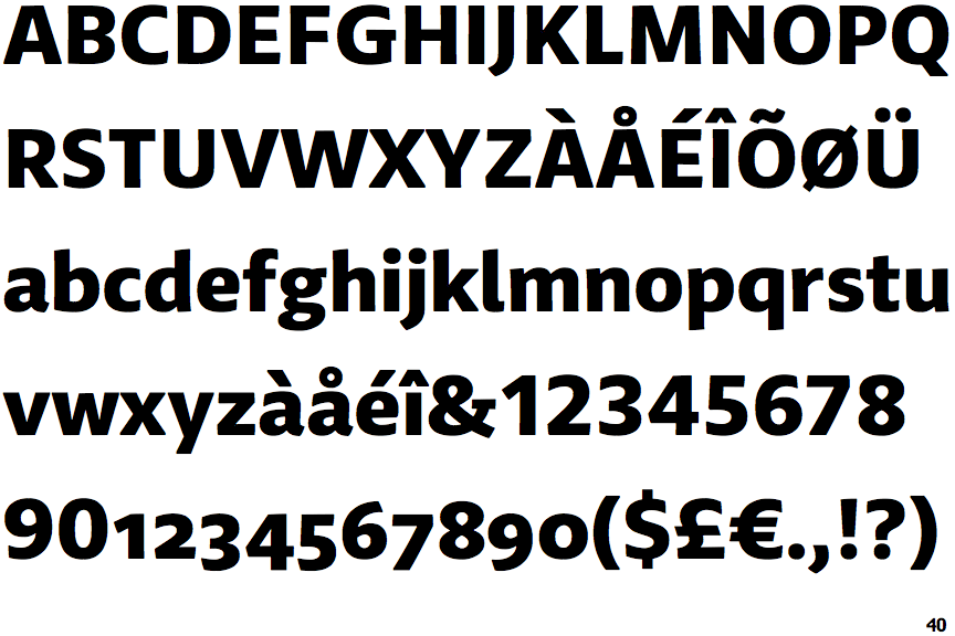
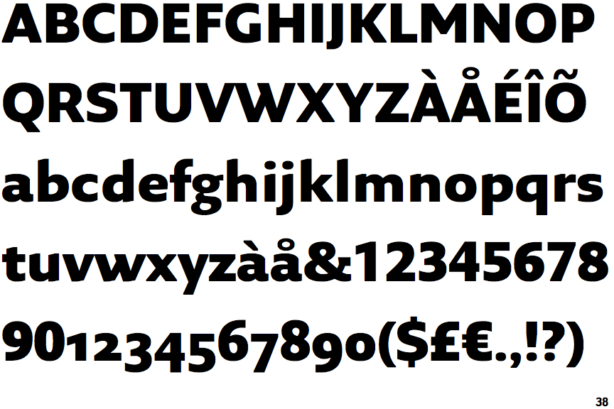
Fresco Sans Plus Black

Fresco Sans Plus Black

Single
The diagonal strokes of the upper-case 'K' meet at the vertical (with or without a gap).
No bar
The upper-case 'G' has no bar.
Plain
The 'l' (lower-case 'L') has no serifs or tail.
Stepped-Left
The centre strokes of the upper-case 'W' meet in a T on the left.