Differences
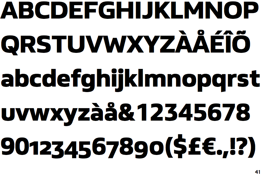
FS Hackney Heavy
 |
The upper-case 'Q' tail crosses the circle.
|
 |
The diagonal strokes of the upper-case 'K' meet in a 'T'.
|
 |
The centre vertex of the upper-case 'M' is above the baseline.
|
 |
The top storey of the '3' is a sharp angle.
|
 |
The upper-case 'G' has a bar to the left.
|
 |
The lower-case 'u' has no stem/serif.
|
Note that the fonts in the icons shown above represent general examples, not necessarily the two fonts chosen for comparison.
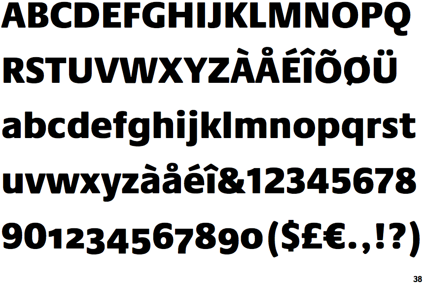
Show ExamplesPraxis Next Black
 |
The upper-case 'Q' tail touches the circle.
|
 |
The diagonal strokes of the upper-case 'K' meet at the vertical (with or without a gap).
|
 |
The centre vertex of the upper-case 'M' is on the baseline.
|
 |
The top storey of the '3' is a smooth curve.
|
 |
The upper-case 'G' has no bar.
|
 |
The lower-case 'u' has a stem/serif.
|

