 |
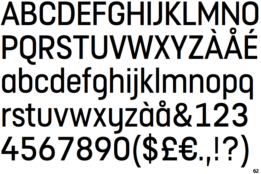
The centre vertex of the upper-case 'M' is above the baseline.
|
 |
The lower-case 'a' stem stops at the top of the bowl (single storey).
|
 |
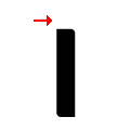
The 'l' (lower-case 'L') has no serifs or tail.
|
 |
The upper-case 'J' has no bar.
|
 |
The leg of the upper-case 'R' is straight.
|
 |
The upper-case 'A' has tapered verticals.
|
 |
The upper-case 'E' is normal letter shape.
|
 |
The dot on the lower-case 'i' or 'j' is square or rectangular.
|
 |
The bar of the lower-case 'f' is double-sided.
|
 |
The bar of the '4' crosses the vertical.
|
There are more than ten differences; only the first ten are shown.
Note that the fonts in the icons shown above represent general examples, not necessarily the two fonts chosen for comparison.
Show Examples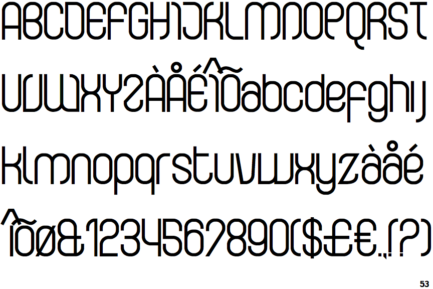
 |
The centre vertex of the upper-case 'M' is on the baseline.
|
 |
The lower-case 'a' stem curves over the top of the bowl (double storey).
|
 |
The 'l' (lower-case 'L') has a right-facing lower serif or tail.
|
 |
The upper-case 'J' has a bar to the left.
|
 |
The leg of the upper-case 'R' is curved outwards.
|
 |
The upper-case 'A' has parallel verticals.
|
 |
The upper-case 'E' is drawn as a 'C' with a bar.
|
 |
The dot on the lower-case 'i' or 'j' is missing.
|
 |
The bar of the lower-case 'f' is single-sided.
|
 |
The bar of the '4' does not cross the vertical.
|