 |
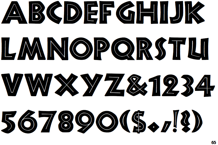
The '&' (ampersand) is traditional style with two enclosed loops.
|
 |
The centre vertex of the upper-case 'M' is on the baseline.
|
 |
The upper-case 'U' has a stem/serif.
|
 |
The upper-case 'E' is normal letter shape.
|
 |
The upper-case 'W' vertices are flat at the top and bottom.
|
Note that the fonts in the icons shown above represent general examples, not necessarily the two fonts chosen for comparison.
Show Examples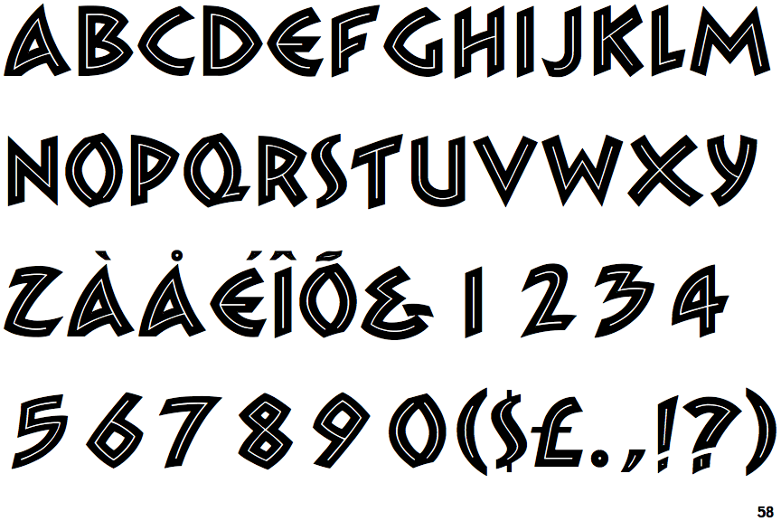
 |
The '&' (ampersand) looks like 'Et' with a gap at the top.
|
 |
The centre vertex of the upper-case 'M' is above the baseline.
|
 |
The upper-case 'U' has no stem/serif.
|
 |
The upper-case 'E' is drawn as a 'C' with a bar.
|
 |
The upper-case 'W' vertices are pointed at the top and bottom.
|