Identifont

Fonts by Appearance

Fonts by Name

Fonts by Similarity

Fonts by Picture

Fonts by Designer/Publisher

Differences

TweetTweet Differences

Compare: and  

FFD Neuland Inline

FFD Neuland Inline

Double
The diagonal strokes of the upper-case 'K' meet in a 'T'.
Outlined
The characters are outlined, shaded, or filled with a pattern.
Flat-Flat
The upper-case 'W' vertices are flat at the top and bottom.

Note that the fonts in the icons shown above represent general examples, not necessarily the two fonts chosen for comparison.

Show Examples
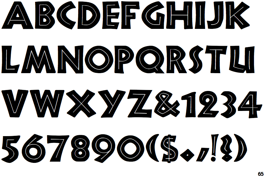
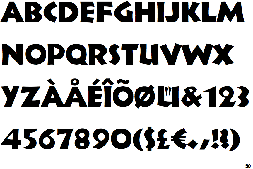
Informal 011

Informal 011

Single
The diagonal strokes of the upper-case 'K' meet at the vertical (with or without a gap).
Solid
The characters are solid.
Pointed-Flat
The upper-case 'W' vertices are pointed at the top, flat at the bottom.