Identifont

Fonts by Appearance

Fonts by Name

Fonts by Similarity

Fonts by Picture

Fonts by Designer/Publisher

Differences

TweetTweet Differences

Compare: and  

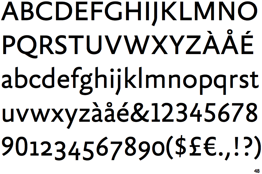
FF Yoga Sans

FF Yoga Sans

Open
The '4' is open.
Parallel
The verticals of the upper-case 'M' are parallel.
2-Storey
The lower-case 'g' is double-storey (with or without gap).
No bar
The upper-case 'G' has no bar.
Stepped-Left
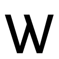
The centre strokes of the upper-case 'W' meet in a T on the left.

Note that the fonts in the icons shown above represent general examples, not necessarily the two fonts chosen for comparison.

Show Examples
Schnebel Sans

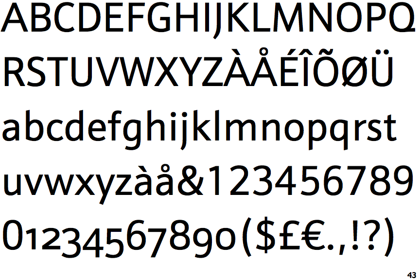
Schnebel Sans

Closed
The '4' is closed.
Sloping
The verticals of the upper-case 'M' are sloping.
1-Storey
The lower-case 'g' is single-storey (with or without loop).
Left
The upper-case 'G' has a bar to the left.
Vertex
The centre strokes of the upper-case 'W' meet at a vertex.