Identifont

Fonts by Appearance

Fonts by Name

Fonts by Similarity

Fonts by Picture

Fonts by Designer/Publisher

Differences

TweetTweet Differences

Compare: and  

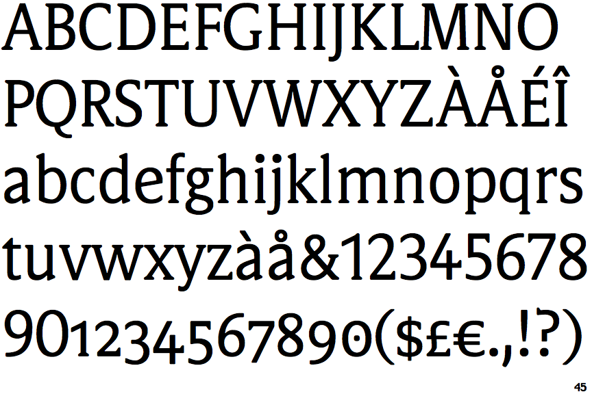
FF Videtur

FF Videtur

Open
The '4' is open.
Sloping
The verticals of the upper-case 'M' are sloping.
Serifs
The centre bar of the upper-case 'E' has serifs.
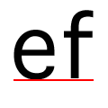
Sloping
The lower-case 'e' has a straight angled bar.
Serifs
The centre bar of the upper-case 'F' has serifs.
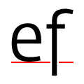
On
The tail of the lower-case 'f' sits on the baseline.

Note that the fonts in the icons shown above represent general examples, not necessarily the two fonts chosen for comparison.

Show Examples
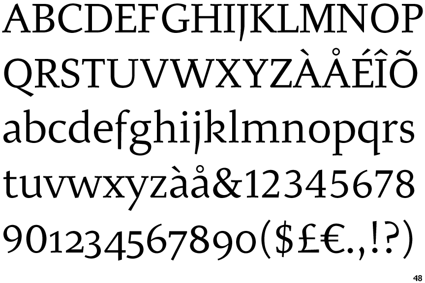
Malena

Malena

Closed
The '4' is closed.
Parallel
The verticals of the upper-case 'M' are parallel.
No Serifs
The centre bar of the upper-case 'E' has no serifs.
Horizontal
The lower-case 'e' has a straight horizontal bar.
No Serifs
The centre bar of the upper-case 'F' has no serifs.
Below
The tail of the lower-case 'f' descends below the baseline.