 |
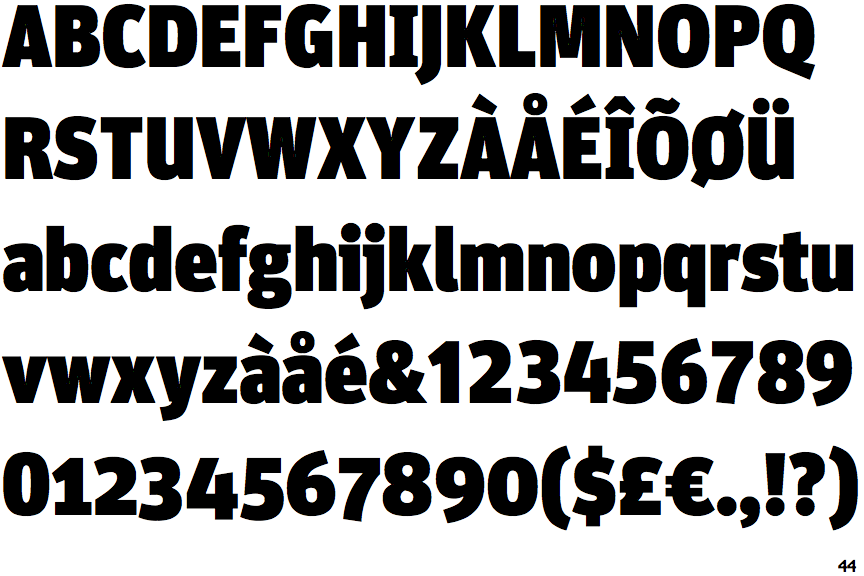
The diagonal strokes of the upper-case 'K' meet at the vertical (with or without a gap).
|
 |
The centre vertex of the upper-case 'M' is above the baseline.
|
 |
The verticals of the upper-case 'M' are parallel.
|
 |
The upper-case 'U' has a stem/serif.
|
 |
The upper-case 'G' has a spur/tail.
|
 |
The 'l' (lower-case 'L') has a right-facing lower serif or tail.
|
 |
The leg of the upper-case 'R' is curved outwards.
|
 |
The '1' (digit one) has double-sided base or serifs.
|
 |
The upper-case letter 'I' has serifs/bars.
|
 |
The lower-case 'i' has a left-facing upper serif.
|
There are more than ten differences; only the first ten are shown.
Note that the fonts in the icons shown above represent general examples, not necessarily the two fonts chosen for comparison.
Show Examples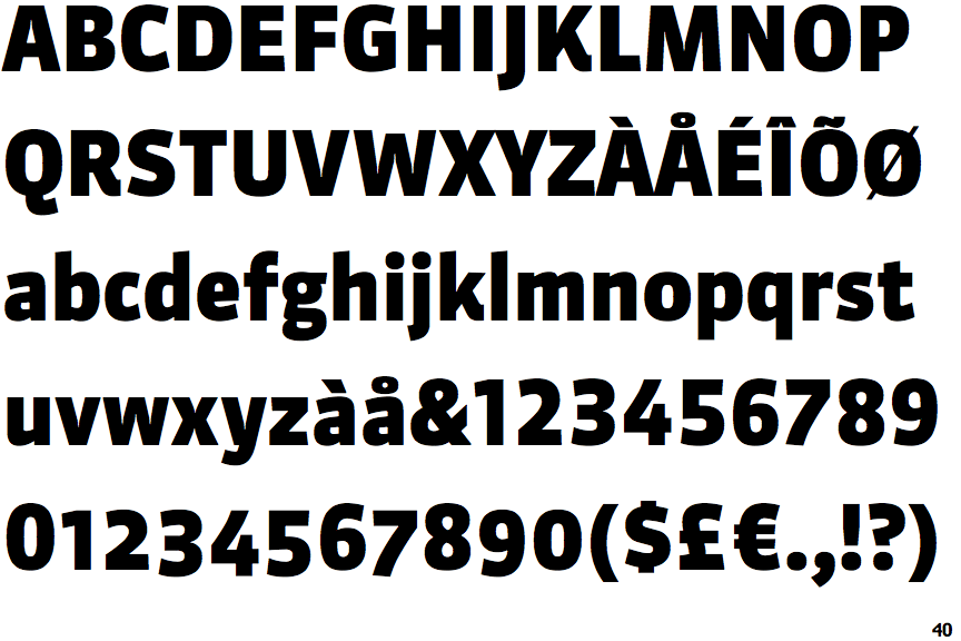
 |
The diagonal strokes of the upper-case 'K' meet in a 'T'.
|
|
The centre vertex of the upper-case 'M' is on the baseline.
|
 |
The verticals of the upper-case 'M' are sloping.
|
 |
The upper-case 'U' has no stem/serif.
|
 |
The upper-case 'G' has no spur/tail.
|
 |
The 'l' (lower-case 'L') has no serifs or tail.
|
 |
The leg of the upper-case 'R' is curved inwards.
|
 |
The '1' (digit one) has no base.
|
 |
The upper-case letter 'I' is plain.
|
 |
The lower-case 'i' has no serifs or tail.
|