 |
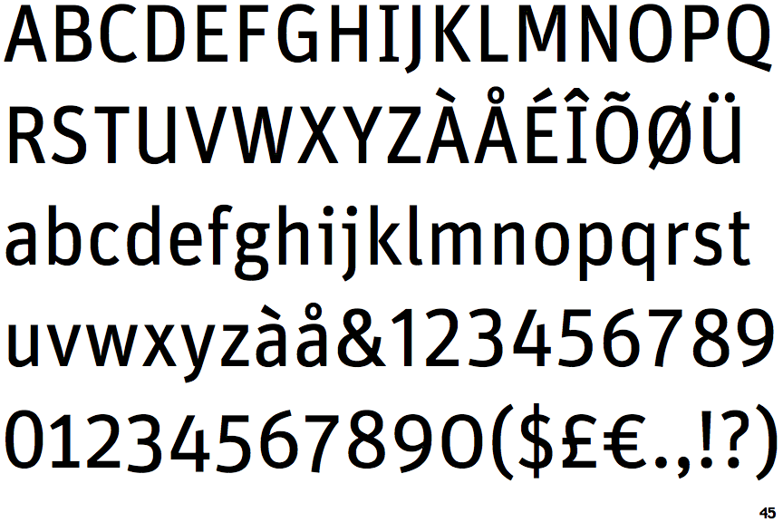
The '$' (dollar) has a single line crossing the 'S'.
|
 |
The '4' is open.
|
 |
The centre vertex of the upper-case 'M' is above the baseline.
|
 |
The verticals of the upper-case 'M' are parallel.
|
 |
The upper-case 'U' has a stem/serif.
|
 |
The upper-case 'G' has a spur/tail.
|
 |
The 'l' (lower-case 'L') has a right-facing lower serif or tail.
|
 |
The tail of the lower-case 'y' is curved or U-shaped to the left.
|
 |
The upper-case letter 'I' has serifs/bars.
|
 |
The lower-case 'i' has a left-facing upper serif.
|
There are more than ten differences; only the first ten are shown.
Note that the fonts in the icons shown above represent general examples, not necessarily the two fonts chosen for comparison.
Show Examples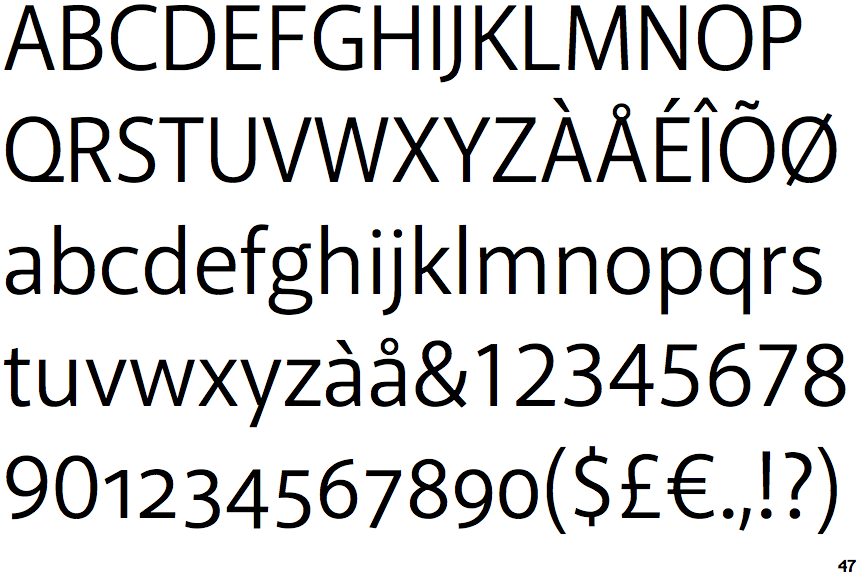
 |
The '$' (dollar) has a single line which does not cross the 'S'.
|
 |
The '4' is closed.
|
|
The centre vertex of the upper-case 'M' is on the baseline.
|
 |
The verticals of the upper-case 'M' are sloping.
|
 |
The upper-case 'U' has no stem/serif.
|
 |
The upper-case 'G' has no spur/tail.
|
 |
The 'l' (lower-case 'L') has no serifs or tail.
|
 |
The tail of the lower-case 'y' is substantially straight.
|
 |
The upper-case letter 'I' is plain.
|
 |
The lower-case 'i' has no serifs or tail.
|