Differences
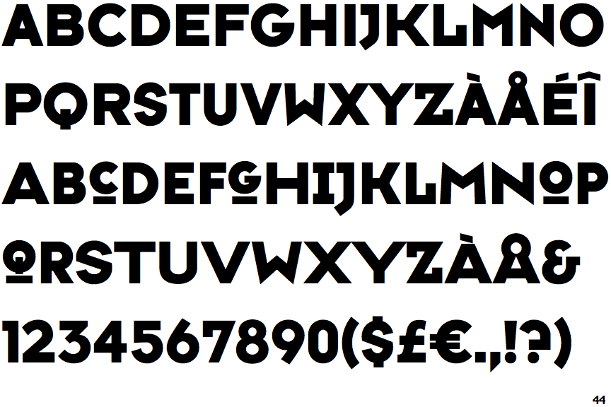
FF Typeface Six
 |
The '&' (ampersand) looks like 'Et' with a gap at the top.
|
 |
The upper-case 'J' descends below the baseline.
|
 |
The diagonal strokes of the upper-case 'K' connect to the vertical via a horizontal bar.
|
 |
The top storey of the '3' is a sharp angle.
|
 |
The upper-case letter 'I' has serifs/bars.
|
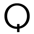 |
The tail of the upper-case 'Q' is vertical.
|
 |
The leg of the upper-case 'R' is separated from the vertical by a distinct horizontal section.
|
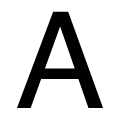 |
The top of the upper-case 'A' is flat.
|
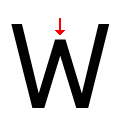 |
The centre vertex of the upper-case 'W' is below the outer strokes.
|
Note that the fonts in the icons shown above represent general examples, not necessarily the two fonts chosen for comparison.
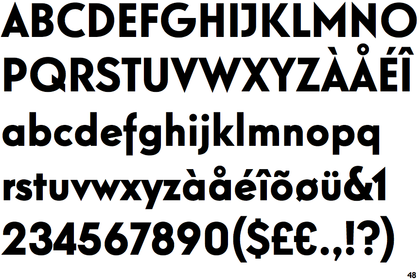
Show ExamplesRelish Bold
 |
The '&' (ampersand) is traditional style with a gap at the top.
|
 |
The upper-case 'J' sits on the baseline.
|
 |
The diagonal strokes of the upper-case 'K' meet at the vertical (with or without a gap).
|
 |
The top storey of the '3' is a smooth curve.
|
 |
The upper-case letter 'I' is plain.
|
 |
The tail of the upper-case 'Q' is slanted.
|
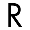 |
The leg of the upper-case 'R' meets the vertical.
|
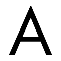 |
The top of the upper-case 'A' is pointed.
|
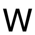 |
The centre vertex of the upper-case 'W' is level with the outer strokes.
|
