 |
The upper-case 'Q' tail is below and separated from the circle.
|
 |
The upper-case 'J' sits on the baseline.
|
 |
The centre vertex of the upper-case 'M' is above the baseline.
|
 |
The upper-case 'Y' right-hand arm forms a continuous stroke with the tail.
|
 |
The 'l' (lower-case 'L') has no serifs or tail.
|
 |
The upper-case 'J' has a bar to the left.
|
 |
The lower-case 'u' has no stem/serif.
|
 |
The bar of the '4' does not cross the vertical.
|
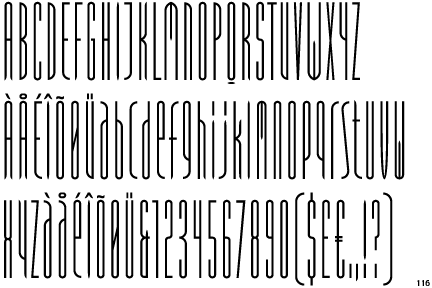
Note that the fonts in the icons shown above represent general examples, not necessarily the two fonts chosen for comparison.
Show Examples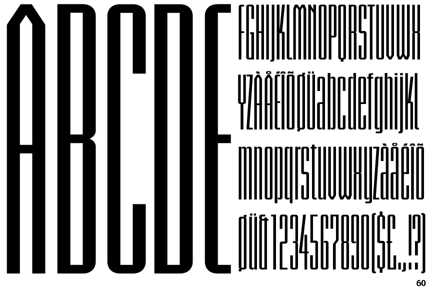
 |
The upper-case 'Q' tail touches the circle.
|
 |
The upper-case 'J' descends below the baseline.
|
 |
The centre vertex of the upper-case 'M' is on the baseline.
|
 |
The upper-case 'Y' arms and tail are separate strokes.
|
 |
The 'l' (lower-case 'L') has a right-facing lower serif or tail.
|
 |
The upper-case 'J' has no bar.
|
 |
The lower-case 'u' has a stem/serif.
|
 |
The bar of the '4' crosses the vertical.
|