 |
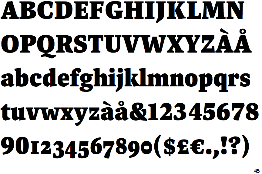
The upper-case 'J' descends below the baseline.
|
 |
The '4' is closed.
|
 |
The top of the upper-case 'A' has a serif or cusp on the left.
|
 |
The top stroke of the upper-case 'C' has no upward-pointing serif.
|
 |
The centre bar of the upper-case 'E' has serifs.
|
 |
The upper-case 'G' foot has no spur or serif.
|
 |
The tail of the upper-case 'J' has a tapered end.
|
 |
The lower storey of the lower-case 'g' has no gap.
|
 |
The leg of the upper-case 'K' has a single right-pointing serif or foot.
|
 |
The centre bar of the upper-case 'F' has serifs.
|
Note that the fonts in the icons shown above represent general examples, not necessarily the two fonts chosen for comparison.
Show Examples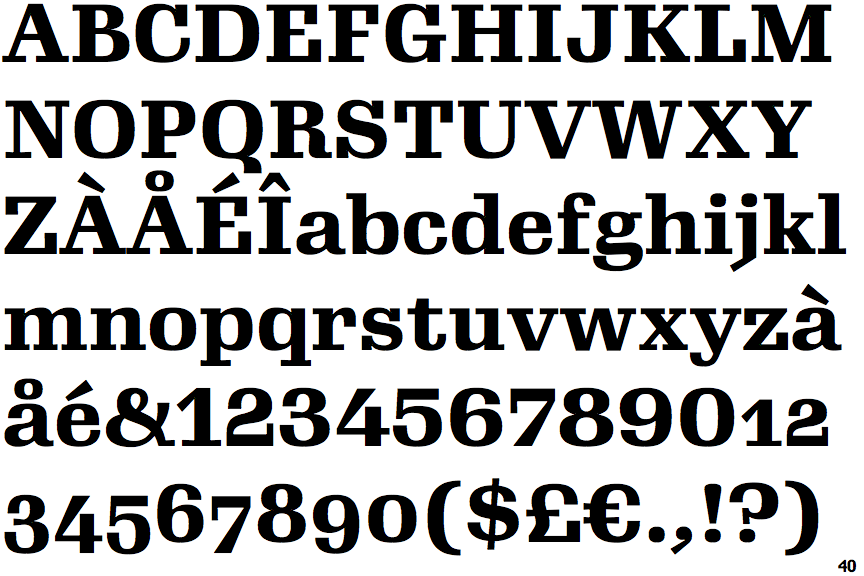
 |
The upper-case 'J' sits on the baseline.
|
 |
The '4' is open.
|
 |
The top of the upper-case 'A' has no serifs or cusps.
|
 |
The top stroke of the upper-case 'C' has a vertical or angled upward-pointing serif.
|
 |
The centre bar of the upper-case 'E' has no serifs.
|
 |
The upper-case 'G' foot has a downward pointing spur.
|
 |
The tail of the upper-case 'J' has a flat end or cusp.
|
 |
The lower storey of the lower-case 'g' has a gap.
|
 |
The leg of the upper-case 'K' has two serifs.
|
 |
The centre bar of the upper-case 'F' has no serifs.
|