 |
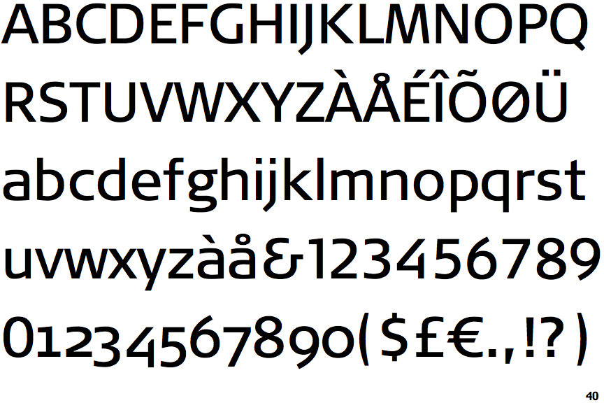
The '&' (ampersand) looks like 'Et' with a gap at the top.
|
 |
The '4' is open.
|
 |
The dot on the '?' (question-mark) is square or rectangular.
|
 |
The upper-case 'G' has no bar.
|
 |
The top of the lower-case 'q' has no spur or serif.
|
 |
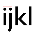
The dot on the lower-case 'i' or 'j' is square or rectangular.
|
 |
The lower storey of the lower-case 'g' has a gap.
|
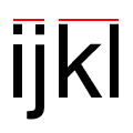 |
The lower-case 'i' or 'j' is the same height as the k and l.
|
 |
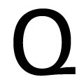
The tail of the upper-case 'Q' is diagonal.
|
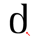 |
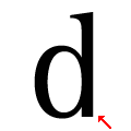
The lower-case 'd' has no lower spur, foot, or serif.
|
Note that the fonts in the icons shown above represent general examples, not necessarily the two fonts chosen for comparison.
Show Examples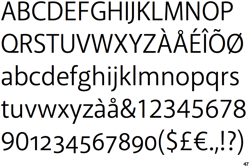
 |
The '&' (ampersand) is traditional style with two enclosed loops.
|
 |
The '4' is closed.
|
 |
The dot on the '?' (question-mark) is circular or oval.
|
 |
The upper-case 'G' has a bar to the left.
|
 |
The top of the lower-case 'q' has a vertical or slightly angled spur (pointed or flat).
|
 |
The dot on the lower-case 'i' or 'j' is circular or oval.
|
 |
The lower storey of the lower-case 'g' has no gap.
|
 |
The lower-case 'i' or 'j' is lower than the k and l.
|
 |
The tail of the upper-case 'Q' is horizontal.
|
 |
The lower-case 'd' has a downward-pointing spur or foot (pointed or flat).
|