Identifont

Fonts by Appearance

Fonts by Name

Fonts by Similarity

Fonts by Picture

Fonts by Designer/Publisher

Differences

TweetTweet Differences

Compare: and  

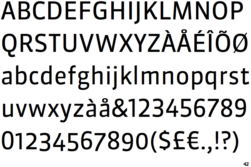
FF Sanuk

FF Sanuk

Below
The upper-case 'J' descends below the baseline.
Open
The '4' is open.
Sloping
The verticals of the upper-case 'M' are sloping.
Plain
The 'l' (lower-case 'L') has no serifs or tail.
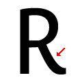
Inwards
The leg of the upper-case 'R' is curved inwards.

Note that the fonts in the icons shown above represent general examples, not necessarily the two fonts chosen for comparison.

Show Examples
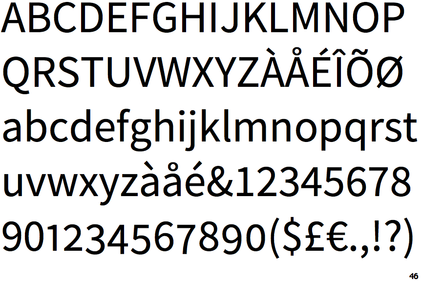
Source Sans

Source Sans

On
The upper-case 'J' sits on the baseline.
Closed
The '4' is closed.
Parallel
The verticals of the upper-case 'M' are parallel.
Right
The 'l' (lower-case 'L') has a right-facing lower serif or tail.
Straight
The leg of the upper-case 'R' is straight.