 |
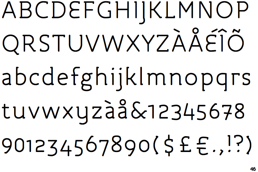
The '$' (dollar) has a single line which does not cross the 'S'.
|
 |
The '&' (ampersand) is traditional style with a gap at the top.
|
 |
The diagonal strokes of the upper-case 'K' connect to the vertical via a horizontal bar.
|
 |
The verticals of the upper-case 'M' are parallel.
|
 |
The centre bar of the upper-case 'P' meets the vertical.
|
 |
The upper-case 'E' is drawn as a single stroke (with or without loop).
|
 |
The centre bar of the upper-case 'R' meets the vertical.
|
 |
The dot on the lower-case 'i' or 'j' is circular or oval.
|
 |
The right side of the upper-case 'G' has a flat section.
|
 |
The lower storey of the lower-case 'g' has no gap.
|
Note that the fonts in the icons shown above represent general examples, not necessarily the two fonts chosen for comparison.
Show Examples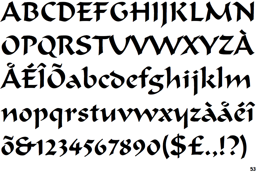
 |
The '$' (dollar) has a single line crossing the 'S'.
|
 |
The '&' (ampersand) looks like 'Et' with one enclosed loop (with or without exit stroke).
|
 |
The diagonal strokes of the upper-case 'K' meet at the vertical (with or without a gap).
|
 |
The verticals of the upper-case 'M' are sloping.
|
 |
The centre bar of the upper-case 'P' leaves a gap with the vertical.
|
 |
The upper-case 'E' is normal letter shape.
|
 |
The centre bar of the upper-case 'R' leaves a gap with the vertical.
|
 |
The dot on the lower-case 'i' or 'j' is diamond-shaped.
|
 |
The right side of the upper-case 'G' is curved.
|
 |
The lower storey of the lower-case 'g' has a gap.
|