 |
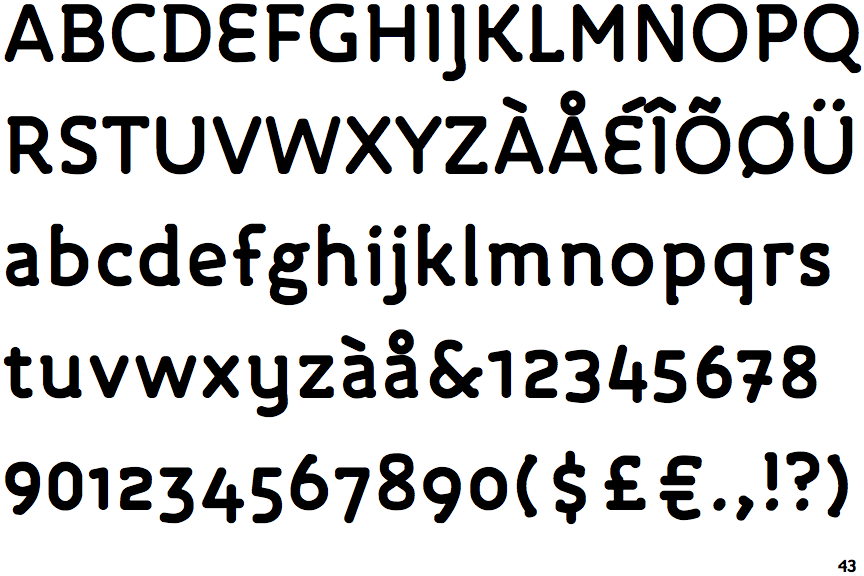
The upper-case 'J' descends below the baseline.
|
 |
The dot on the '?' (question-mark) is circular or oval.
|
 |
The verticals of the upper-case 'M' are parallel.
|
 |
The lower-case 'g' is double-storey (with or without gap).
|
 |
The upper-case 'G' has a bar to the left.
|
 |
The upper-case 'E' is drawn as a single stroke (with or without loop).
|
 |
The lower-case 'e' has a straight angled bar.
|
 |
The dot on the lower-case 'i' or 'j' is circular or oval.
|
 |
The lower-case 'i' has a left-facing upper serif.
|
 |
The bar of the '4' crosses the vertical.
|
Note that the fonts in the icons shown above represent general examples, not necessarily the two fonts chosen for comparison.
Show Examples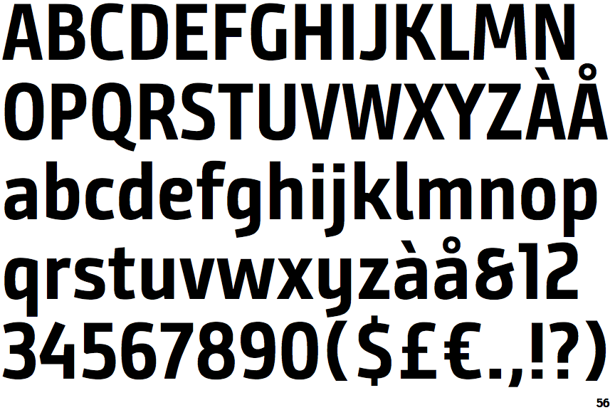
 |
The upper-case 'J' sits on the baseline.
|
 |
The dot on the '?' (question-mark) is square or rectangular.
|
 |
The verticals of the upper-case 'M' are sloping.
|
 |
The lower-case 'g' is single-storey (with or without loop).
|
 |
The upper-case 'G' has no bar.
|
 |
The upper-case 'E' is normal letter shape.
|
 |
The lower-case 'e' has a curved bar with no straight segment.
|
 |
The dot on the lower-case 'i' or 'j' is square or rectangular.
|
 |
The lower-case 'i' has no serifs or tail.
|
 |
The bar of the '4' does not cross the vertical.
|