 |
The '&' (ampersand) looks like an 'E' with a solid or broken line.
|
 |
The diagonal strokes of the upper-case 'K' meet in a 'T'.
|
 |
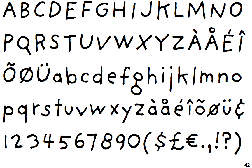
The lower-case 'g' is double-storey (with or without gap).
|
 |
The lower-case 'a' stem stops at the top of the bowl (single storey).
|
 |
The right side of the upper-case 'G' is curved.
|
 |
The bar of the lower-case 'f' is double-sided.
|
 |
The bar of the '4' crosses the vertical.
|
Note that the fonts in the icons shown above represent general examples, not necessarily the two fonts chosen for comparison.
Show Examples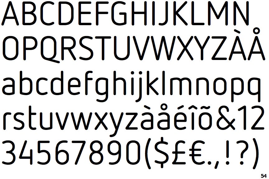
 |
The '&' (ampersand) is traditional style with a gap at the top.
|
 |
The diagonal strokes of the upper-case 'K' meet at the vertical (with or without a gap).
|
 |
The lower-case 'g' is single-storey (with or without loop).
|
 |
The lower-case 'a' stem curves over the top of the bowl (double storey).
|
 |
The right side of the upper-case 'G' has a flat section.
|
 |
The bar of the lower-case 'f' is single-sided.
|
 |
The bar of the '4' does not cross the vertical.
|