Identifont

Fonts by Appearance

Fonts by Name

Fonts by Similarity

Fonts by Picture

Fonts by Designer/Publisher

Differences

TweetTweet Differences

Compare: and  

FF Plus Sans

FF Plus Sans

Open
The '&' (ampersand) is traditional style with a gap at the top.
On
The upper-case 'J' sits on the baseline.
Parallel
The verticals of the upper-case 'M' are parallel.
1-Storey
The lower-case 'g' is single-storey (with or without loop).
Left
The tail of the lower-case 'y' is curved or U-shaped to the left.

Note that the fonts in the icons shown above represent general examples, not necessarily the two fonts chosen for comparison.

Show Examples
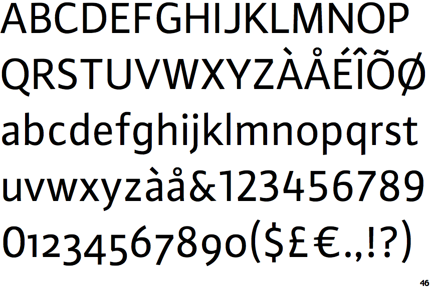
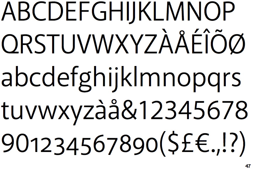
Akagi

Akagi

Closed
The '&' (ampersand) is traditional style with two enclosed loops.
Below
The upper-case 'J' descends below the baseline.
Sloping
The verticals of the upper-case 'M' are sloping.
2-Storey
The lower-case 'g' is double-storey (with or without gap).
Straight
The tail of the lower-case 'y' is substantially straight.