Differences
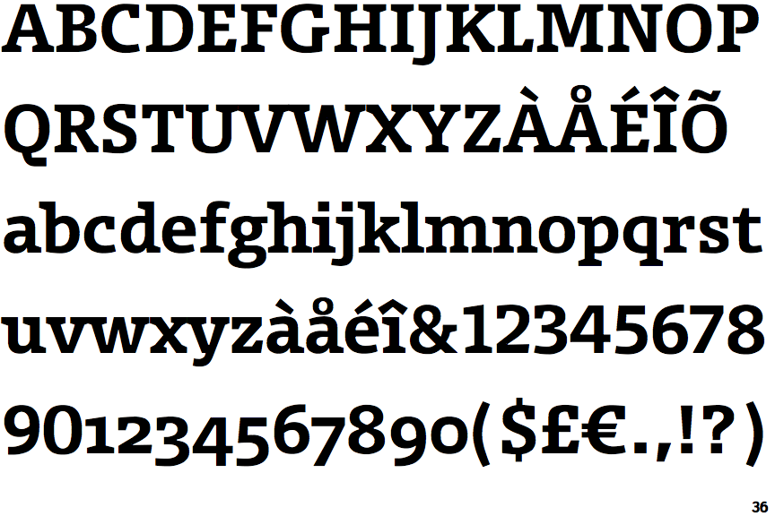
FF Olsen Bold
 |
The upper-case 'Q' tail touches the circle.
|
 |
The upper-case 'J' descends below the baseline.
|
 |
The dot on the '?' (question-mark) is square or rectangular.
|
 |
The verticals of the upper-case 'M' are parallel.
|
 |
The centre bar of the upper-case 'P' leaves a gap with the vertical.
|
 |
The lower-case 'g' is double-storey (with or without gap).
|
 |
The foot of the '4' has no serifs.
|
 |
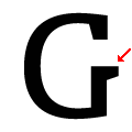
The bar of the upper-case 'G' is single-sided, right-facing.
|
 |
The lower-case 'e' has a straight horizontal bar.
|
 |
The dot on the lower-case 'i' or 'j' is square or rectangular.
|
There are more than ten differences; only the first ten are shown.
Note that the fonts in the icons shown above represent general examples, not necessarily the two fonts chosen for comparison.
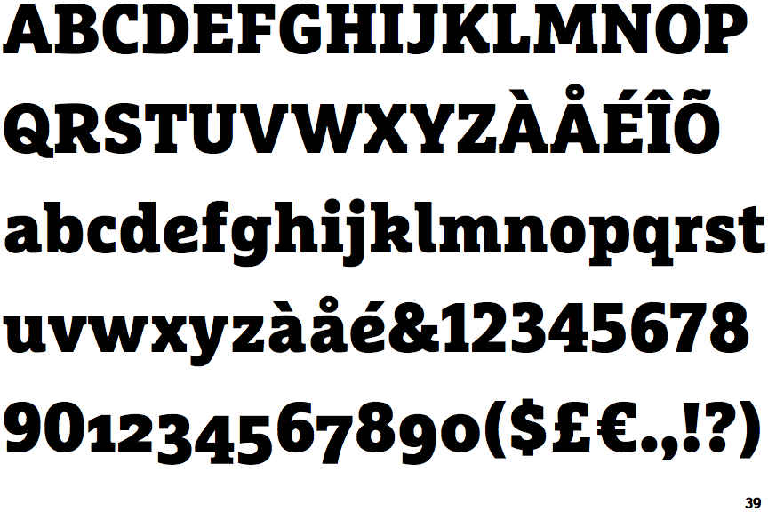
Show ExamplesFF Marselis Slab Black
 |
The upper-case 'Q' tail crosses the circle.
|
 |
The upper-case 'J' sits on the baseline.
|
 |
The dot on the '?' (question-mark) is circular or oval.
|
 |
The verticals of the upper-case 'M' are sloping.
|
 |
The centre bar of the upper-case 'P' meets the vertical.
|
 |
The lower-case 'g' is single-storey (with or without loop).
|
 |
The foot of the '4' has double-sided serifs.
|
 |
The bar of the upper-case 'G' is single-sided, left-facing.
|
 |
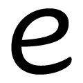
The lower-case 'e' has a curved bar with no straight segment.
|
 |
The dot on the lower-case 'i' or 'j' is circular or oval.
|

