 |
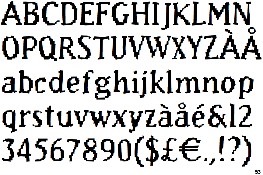
The '&' (ampersand) is traditional style with a gap at the top.
|
 |
The upper-case 'J' descends below the baseline.
|
 |
The diagonal strokes of the upper-case 'K' meet at the vertical (with or without a gap).
|
 |
The centre vertex of the upper-case 'M' is above the baseline.
|
 |
The top stroke of the upper-case 'C' has no upward-pointing serif.
|
 |
The upper-case 'G' foot has no spur or serif.
|
 |
The foot of the '4' has no serifs.
|
 |
The lower-case 'e' has a straight angled bar.
|
 |
The character outlines are stepped or jagged.
|
Note that the fonts in the icons shown above represent general examples, not necessarily the two fonts chosen for comparison.
Show Examples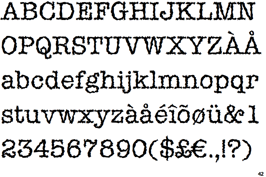
 |
The '&' (ampersand) is traditional style with two enclosed loops.
|
 |
The upper-case 'J' sits on the baseline.
|
 |
The diagonal strokes of the upper-case 'K' meet in a 'T'.
|
 |
The centre vertex of the upper-case 'M' is on the baseline.
|
 |
The top stroke of the upper-case 'C' has a vertical or angled upward-pointing serif.
|
 |
The upper-case 'G' foot has a downward pointing spur.
|
 |
The foot of the '4' has double-sided serifs.
|
 |
The lower-case 'e' has a straight horizontal bar.
|
 |
The character outlines are corroded, roughened, or dirty.
|