Identifont

Fonts by Appearance

Fonts by Name

Fonts by Similarity

Fonts by Picture

Fonts by Designer/Publisher

Differences

TweetTweet Differences

Compare: and  

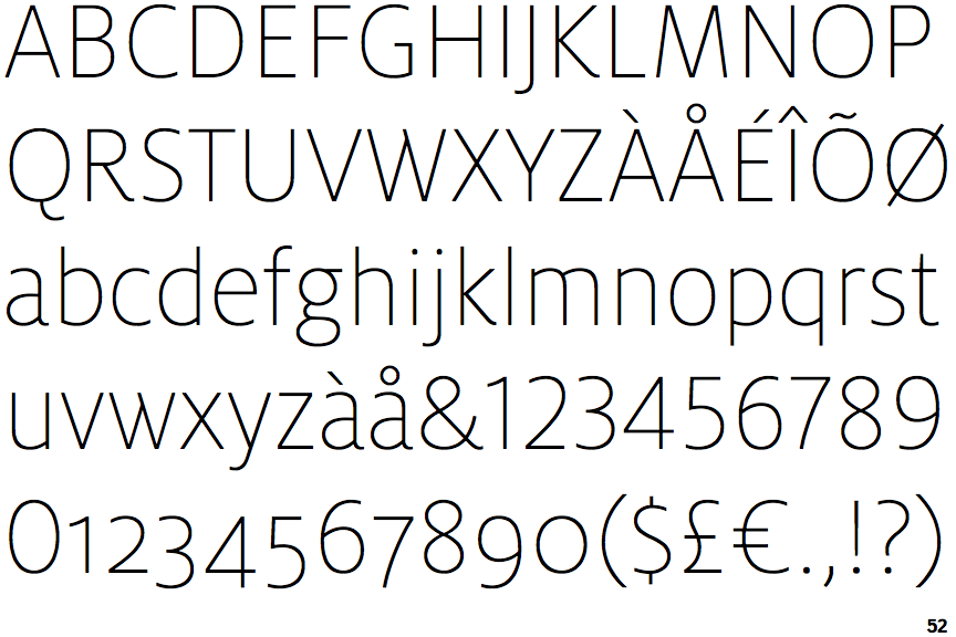
FF Milo Thin

FF Milo Thin

Below
The upper-case 'J' descends below the baseline.
Single
The diagonal strokes of the upper-case 'K' meet at the vertical (with or without a gap).
Circle
The dot on the '?' (question-mark) is circular or oval.
Sloping
The verticals of the upper-case 'M' are sloping.
No spur
The upper-case 'G' has no spur/tail.

Note that the fonts in the icons shown above represent general examples, not necessarily the two fonts chosen for comparison.

Show Examples
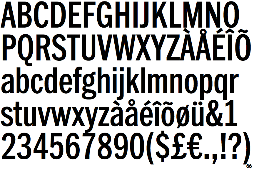
ITC Franklin Condensed

ITC Franklin Condensed

On
The upper-case 'J' sits on the baseline.
Double
The diagonal strokes of the upper-case 'K' meet in a 'T'.
Square/rectangular
The dot on the '?' (question-mark) is square or rectangular.
Parallel
The verticals of the upper-case 'M' are parallel.
Spur
The upper-case 'G' has a spur/tail.