Identifont

Fonts by Appearance

Fonts by Name

Fonts by Similarity

Fonts by Picture

Fonts by Designer/Publisher

Differences

TweetTweet Differences

Compare: and  

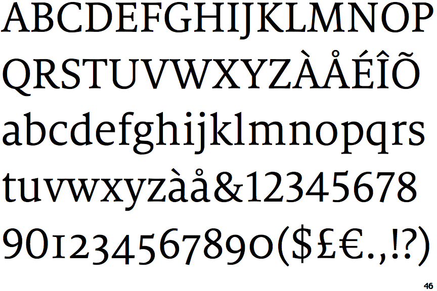
FF Milo Serif

FF Milo Serif

Below
The upper-case 'J' descends below the baseline.
Sloping
The verticals of the upper-case 'M' are sloping.
Both
The centre vertex of the upper-case 'W' has two separate serifs.
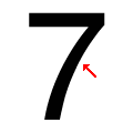
Concave
The stem of the '7' is curved inwards.

Note that the fonts in the icons shown above represent general examples, not necessarily the two fonts chosen for comparison.

Show Examples
Charter BT Pro Bold

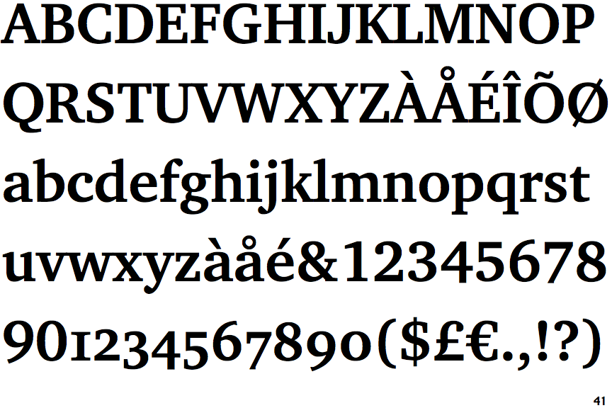
Charter BT Pro Bold

On
The upper-case 'J' sits on the baseline.
Parallel
The verticals of the upper-case 'M' are parallel.
None
The centre vertex of the upper-case 'W' has no serifs.
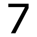
Straight
The stem of the '7' is straight.