Identifont

Fonts by Appearance

Fonts by Name

Fonts by Similarity

Fonts by Picture

Fonts by Designer/Publisher

Differences

TweetTweet Differences

Compare: and  

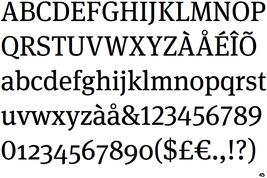
FF Meta Serif

FF Meta Serif

Open
The '4' is open.
Round
The top storey of the '3' is a smooth curve.
Gap
The lower storey of the lower-case 'g' has a gap.

Note that the fonts in the icons shown above represent general examples, not necessarily the two fonts chosen for comparison.

Show Examples
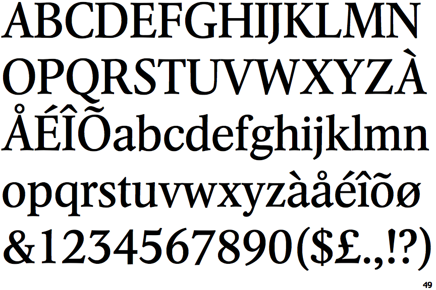
Arena New

Arena New

Closed
The '4' is closed.
Angled
The top storey of the '3' is a sharp angle.
No gap
The lower storey of the lower-case 'g' has no gap.