Identifont

Fonts by Appearance

Fonts by Name

Fonts by Similarity

Fonts by Picture

Fonts by Designer/Publisher

Differences

TweetTweet Differences

Compare: and  

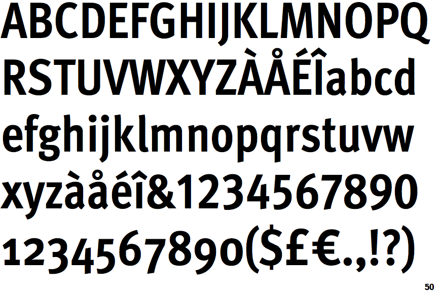
FF Meta Condensed Bold

FF Meta Condensed Bold

Below
The upper-case 'J' descends below the baseline.
Baseline
The centre vertex of the upper-case 'M' is on the baseline.
Right
The 'l' (lower-case 'L') has a right-facing lower serif or tail.
Gap
The lower storey of the lower-case 'g' has a gap.

Note that the fonts in the icons shown above represent general examples, not necessarily the two fonts chosen for comparison.

Show Examples
FF Fago Condensed

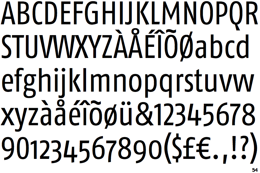
FF Fago Condensed

On
The upper-case 'J' sits on the baseline.
Above
The centre vertex of the upper-case 'M' is above the baseline.
Plain
The 'l' (lower-case 'L') has no serifs or tail.
No gap
The lower storey of the lower-case 'g' has no gap.