Differences
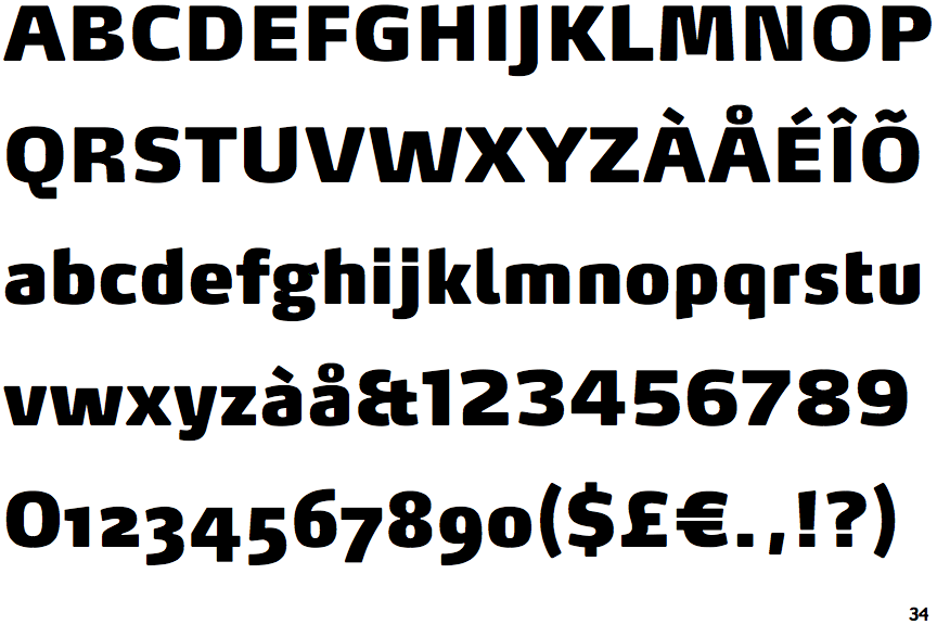
FF Max Fat
 |
The upper-case 'Q' tail touches the circle.
|
 |
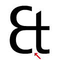
The '&' (ampersand) looks like 'Et' with a gap at the bottom (with or without exit stroke).
|
 |
The upper-case 'J' descends below the baseline.
|
 |
The '4' is closed.
|
 |
The verticals of the upper-case 'M' are sloping.
|
 |
The lower-case 'g' is double-storey (with or without gap).
|
 |
The 'l' (lower-case 'L') has a right-facing lower serif or tail.
|
 |
The leg of the upper-case 'R' is curved outwards.
|
 |
The tail of the lower-case 'y' is curved or U-shaped to the left.
|
 |
The lower-case 'u' has no stem/serif.
|
There are more than ten differences; only the first ten are shown.
Note that the fonts in the icons shown above represent general examples, not necessarily the two fonts chosen for comparison.
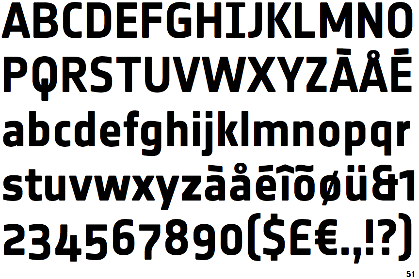
Show ExamplesPTL Notes Soft Bold
 |
The upper-case 'Q' tail crosses the circle.
|
 |
The '&' (ampersand) looks like 'Et' with one enclosed loop (with or without exit stroke).
|
 |
The upper-case 'J' sits on the baseline.
|
 |
The '4' is open.
|
 |
The verticals of the upper-case 'M' are parallel.
|
 |
The lower-case 'g' is single-storey (with or without loop).
|
 |
The 'l' (lower-case 'L') has no serifs or tail.
|
 |
The leg of the upper-case 'R' is straight.
|
 |
The tail of the lower-case 'y' is substantially straight.
|
 |
The lower-case 'u' has a stem/serif.
|

