 |
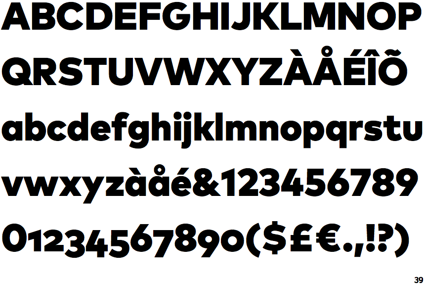
The '4' is open.
|
 |
The verticals of the upper-case 'M' are parallel.
|
 |
The tail of the lower-case 't' is curved.
|
 |
The tail of the lower-case 'j' is curved with no upper serif.
|
Note that the fonts in the icons shown above represent general examples, not necessarily the two fonts chosen for comparison.
Show Examples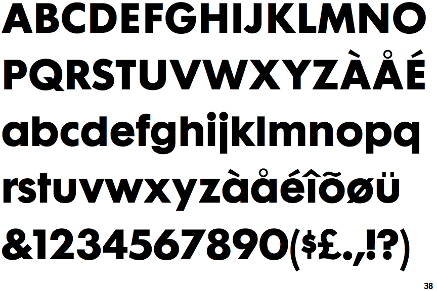
 |
The '4' is closed.
|
 |
The verticals of the upper-case 'M' are sloping.
|
 |
The tail of the lower-case 't' is straight.
|
 |
The tail of the lower-case 'j' is straight with no upper serif.
|