 |
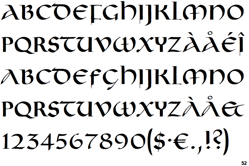
The upper-case 'Q' tail touches the circle.
|
 |
The '$' (dollar) has a single line crossing the 'S'.
|
 |
The dot on the '?' (question-mark) is diamond-shaped or triangular.
|
 |
The verticals of the upper-case 'M' are sloping.
|
 |
The top storey of the '3' is a sharp angle.
|
 |
The upper-case 'U' has a stem/serif.
|
 |
The upper-case 'G' has a spur/tail.
|
 |
The upper-case 'E' is drawn as a 'C' with a bar.
|
 |
The lower-case 'e' is drawn as a 'c' with a bar.
|
 |
The lower-case 'u' has a stem/serif.
|
There are more than ten differences; only the first ten are shown.
Note that the fonts in the icons shown above represent general examples, not necessarily the two fonts chosen for comparison.
Show Examples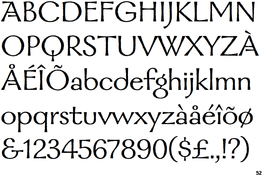
 |
The upper-case 'Q' tail crosses the circle.
|
 |
The '$' (dollar) has a single line which does not cross the 'S'.
|
 |
The dot on the '?' (question-mark) is square or rectangular.
|
 |
The verticals of the upper-case 'M' are parallel.
|
 |
The top storey of the '3' is a smooth curve.
|
 |
The upper-case 'U' has no stem/serif.
|
 |
The upper-case 'G' has no spur/tail.
|
 |
The upper-case 'E' is normal letter shape.
|
 |
The lower-case 'e' has a straight horizontal bar.
|
 |
The lower-case 'u' has no stem/serif.
|