Differences
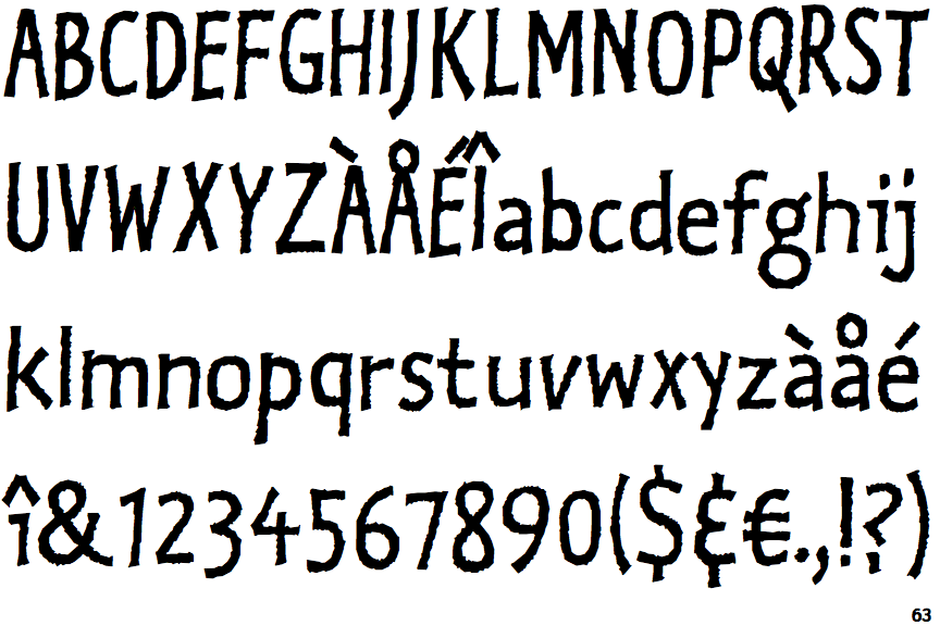
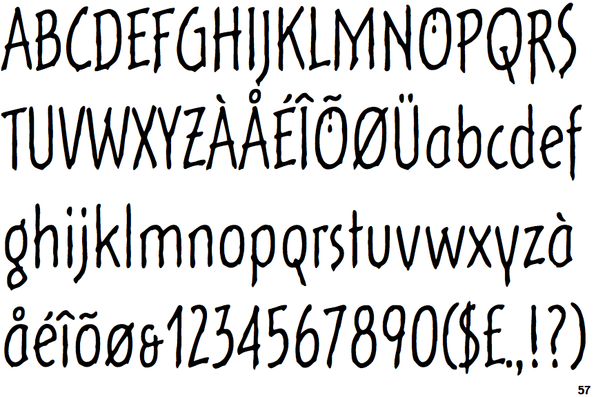
FF Kosmik
 |
The '$' (dollar) has a single line which does not cross the 'S'.
|
 |
The '&' (ampersand) is traditional style with two enclosed loops.
|
 |
The '4' is open.
|
 |
The diagonal strokes of the upper-case 'K' meet at the vertical (with or without a gap).
|
 |
The centre vertex of the upper-case 'M' is above the baseline.
|
 |
The top storey of the '3' is a smooth curve.
|
 |
The centre bar of the upper-case 'P' meets the vertical.
|
 |
The lower-case 'a' stem curves over the top of the bowl (double storey).
|
 |
The centre bar of the upper-case 'R' meets the vertical.
|
 |
The lower-case 'u' has a stem/serif.
|
There are more than ten differences; only the first ten are shown.
Note that the fonts in the icons shown above represent general examples, not necessarily the two fonts chosen for comparison.
Show ExamplesITC Out of the Fridge
 |
The '$' (dollar) has a single line crossing the 'S'.
|
 |
The '&' (ampersand) looks like 'Et' with one enclosed loop (with or without exit stroke).
|
 |
The '4' is closed.
|
 |
The diagonal strokes of the upper-case 'K' meet in a 'T'.
|
 |
The centre vertex of the upper-case 'M' is on the baseline.
|
 |
The top storey of the '3' is a sharp angle.
|
 |
The centre bar of the upper-case 'P' crosses the vertical.
|
 |
The lower-case 'a' stem stops at the top of the bowl (single storey).
|
 |
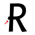
The centre bar of the upper-case 'R' crosses the vertical.
|
 |
The lower-case 'u' has no stem/serif.
|

