Identifont

Fonts by Appearance

Fonts by Name

Fonts by Similarity

Fonts by Picture

Fonts by Designer/Publisher

Differences

TweetTweet Differences

Compare: and  

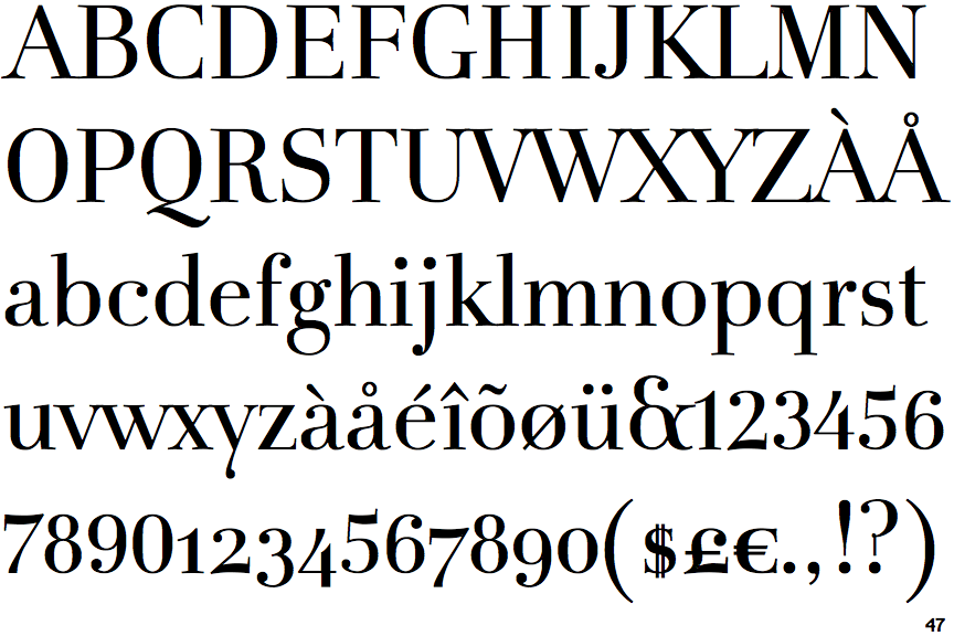
FF Holmen

FF Holmen

Open
The '&' (ampersand) is traditional style with a gap at the top.
On
The upper-case 'J' sits on the baseline.
Open
The '4' is open.
No top serif
The top stroke of the upper-case 'C' has no upward-pointing serif.

Note that the fonts in the icons shown above represent general examples, not necessarily the two fonts chosen for comparison.

Show Examples
Playfair Display

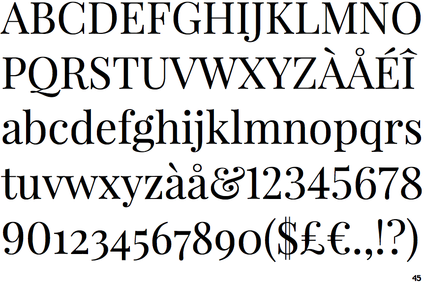
Playfair Display

Gap top
The '&' (ampersand) looks like 'Et' with a gap at the top.
Below
The upper-case 'J' descends below the baseline.
Closed
The '4' is closed.
Top serif
The top stroke of the upper-case 'C' has a vertical or angled upward-pointing serif.