Identifont

Fonts by Appearance

Fonts by Name

Fonts by Similarity

Fonts by Picture

Fonts by Designer/Publisher

Differences

TweetTweet Differences

Compare: and  

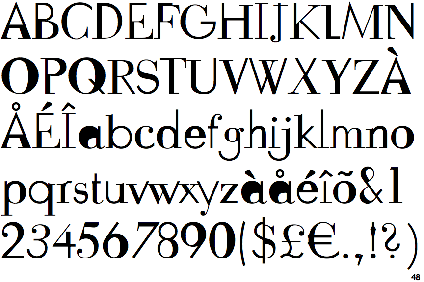
FF Fudoni One

FF Fudoni One

Crosses
The upper-case 'Q' tail crosses the circle.
Closed
The '&' (ampersand) is traditional style with two enclosed loops.
Below
The upper-case 'J' descends below the baseline.
Serif
The characters have serifs.
1-Storey
The lower-case 'a' stem stops at the top of the bowl (single storey).

Note that the fonts in the icons shown above represent general examples, not necessarily the two fonts chosen for comparison.

Show Examples
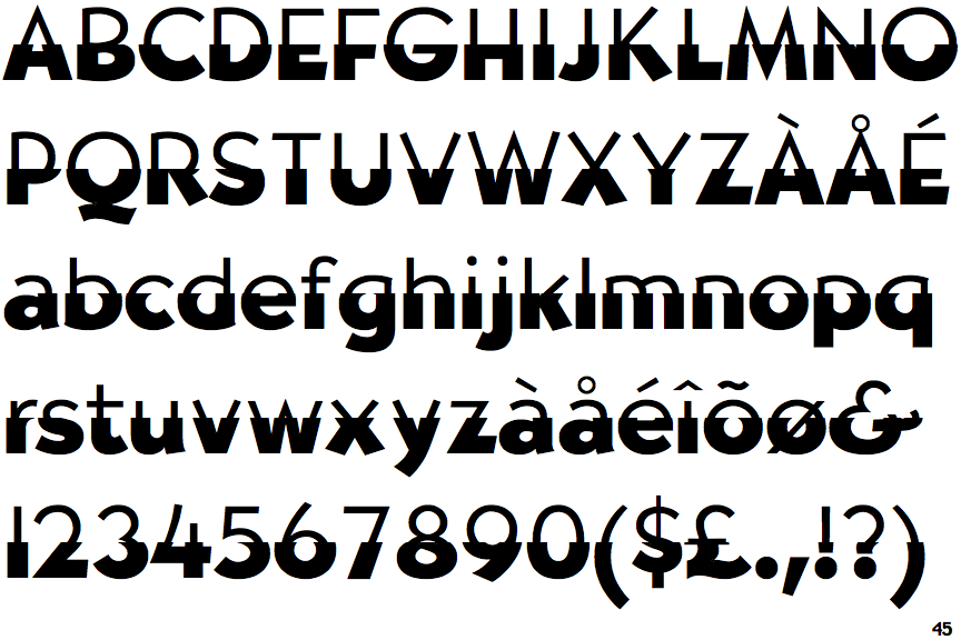
Erasurehead Poster

Erasurehead Poster

Touches
The upper-case 'Q' tail touches the circle.
Gap top
The '&' (ampersand) looks like 'Et' with a gap at the top.
On
The upper-case 'J' sits on the baseline.
Sans-serif
The characters do not have serifs.
2-Storey
The lower-case 'a' stem curves over the top of the bowl (double storey).