Identifont

Fonts by Appearance

Fonts by Name

Fonts by Similarity

Fonts by Picture

Fonts by Designer/Publisher

Differences

TweetTweet Differences

Compare: and  

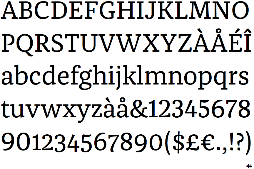
FF Franziska

FF Franziska

Open
The '4' is open.
Sloping
The verticals of the upper-case 'M' are sloping.
Gap
The centre bar of the upper-case 'P' leaves a gap with the vertical.
No top serif
The top stroke of the upper-case 'C' has no upward-pointing serif.
No-Spur
The upper-case 'G' foot has no spur or serif.

Note that the fonts in the icons shown above represent general examples, not necessarily the two fonts chosen for comparison.

Show Examples
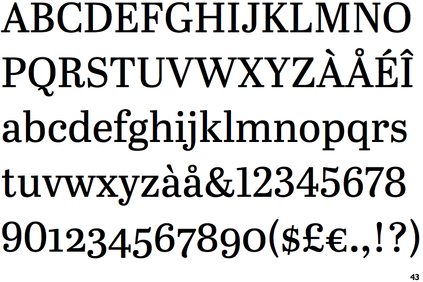
Abril Text

Abril Text

Closed
The '4' is closed.
Parallel
The verticals of the upper-case 'M' are parallel.
Meets
The centre bar of the upper-case 'P' meets the vertical.
Top serif
The top stroke of the upper-case 'C' has a vertical or angled upward-pointing serif.
Spur
The upper-case 'G' foot has a downward pointing spur.