Identifont

Fonts by Appearance

Fonts by Name

Fonts by Similarity

Fonts by Picture

Fonts by Designer/Publisher

Differences

TweetTweet Differences

Compare: and  

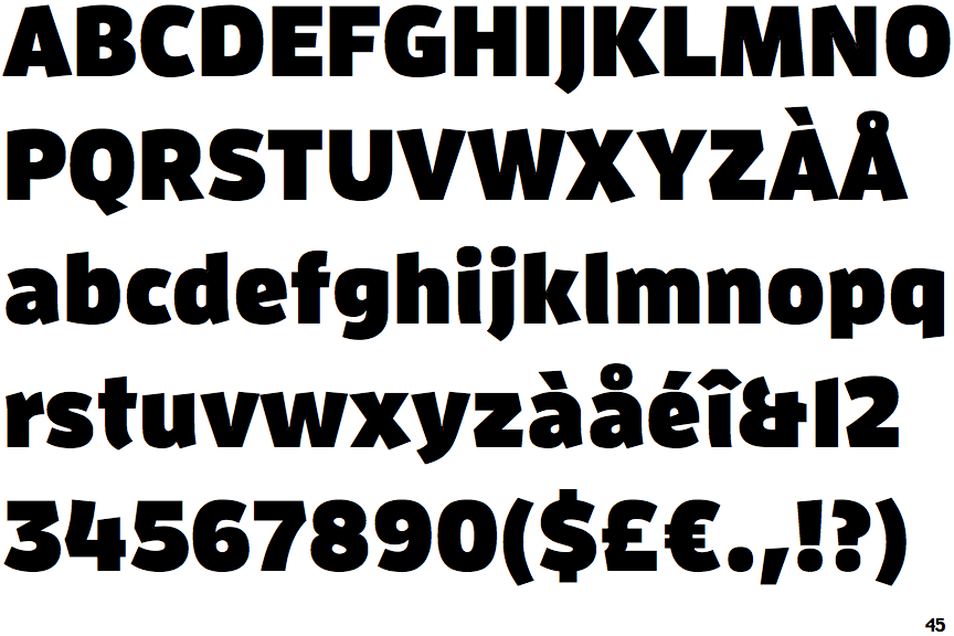
FF Enzo Black

FF Enzo Black

Et shaped
The '&' (ampersand) looks like 'Et' with one enclosed loop (with or without exit stroke).
Open
The '4' is open.
Sloping
The verticals of the upper-case 'M' are sloping.
Angled
The top storey of the '3' is a sharp angle.
Left
The upper-case 'G' has a bar to the left.

Note that the fonts in the icons shown above represent general examples, not necessarily the two fonts chosen for comparison.

Show Examples
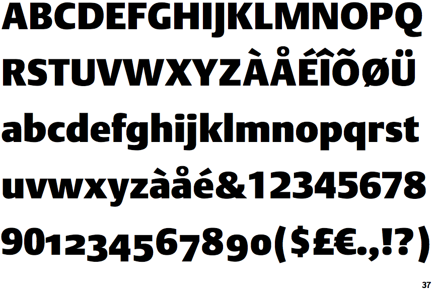
DTL Argo Heavy

DTL Argo Heavy

Closed
The '&' (ampersand) is traditional style with two enclosed loops.
Closed
The '4' is closed.
Parallel
The verticals of the upper-case 'M' are parallel.
Round
The top storey of the '3' is a smooth curve.
No bar
The upper-case 'G' has no bar.