Identifont

Fonts by Appearance

Fonts by Name

Fonts by Similarity

Fonts by Picture

Fonts by Designer/Publisher

Differences

TweetTweet Differences

Compare: and  

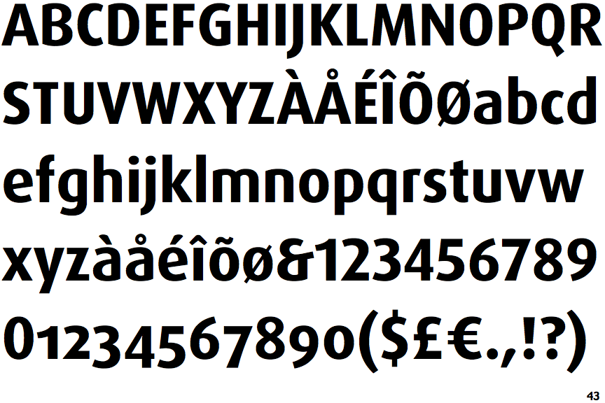
FF Dax Bold

FF Dax Bold

Sloping
The verticals of the upper-case 'M' are sloping.
Left
The upper-case 'G' has a bar to the left.
Sloping
The lower-case 'e' has a straight angled bar.
Straight
The tail of the upper-case 'Q' is straight (horizontal, diagonal, or vertical).

Note that the fonts in the icons shown above represent general examples, not necessarily the two fonts chosen for comparison.

Show Examples
Conto Black

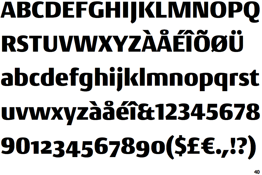
Conto Black

Parallel
The verticals of the upper-case 'M' are parallel.
No bar
The upper-case 'G' has no bar.
Horizontal
The lower-case 'e' has a straight horizontal bar.
Curved
The tail of the upper-case 'Q' is curved, S-shaped, or Z-shaped.