 |
The upper-case 'Q' tail crosses the circle.
|
 |
The '&' (ampersand) is traditional style with two enclosed loops.
|
 |
The dot on the '?' (question-mark) is square or rectangular.
|
 |
The upper-case 'G' has a bar to the left.
|
 |
The 'l' (lower-case 'L') has a right-facing lower serif or tail.
|
 |
The dot on the lower-case 'i' or 'j' is square or rectangular.
|
 |
The lower-case 'e' has a straight horizontal bar.
|
 |
The '1' (digit one) has no base.
|
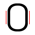 |
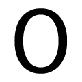
The verticals of the upper-case letter 'O' have straight segments.
|
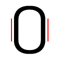 |
The verticals of the digit '0' have straight segments.
|
There are more than ten differences; only the first ten are shown.
Note that the fonts in the icons shown above represent general examples, not necessarily the two fonts chosen for comparison.
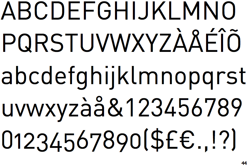
Show Examples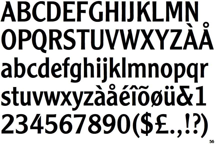
 |
The upper-case 'Q' tail touches the circle.
|
 |
The '&' (ampersand) is traditional style with a gap at the top.
|
 |
The dot on the '?' (question-mark) is circular or oval.
|
 |
The upper-case 'G' has no bar.
|
 |
The 'l' (lower-case 'L') has no serifs or tail.
|
 |
The dot on the lower-case 'i' or 'j' is circular or oval.
|
 |
The lower-case 'e' has a straight angled bar.
|
 |
The '1' (digit one) has double-sided base or serifs.
|
 |
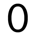
The verticals of the upper-case letter 'O' are fully curved.
|
 |
The verticals of the digit '0' are fully curved.
|