 |
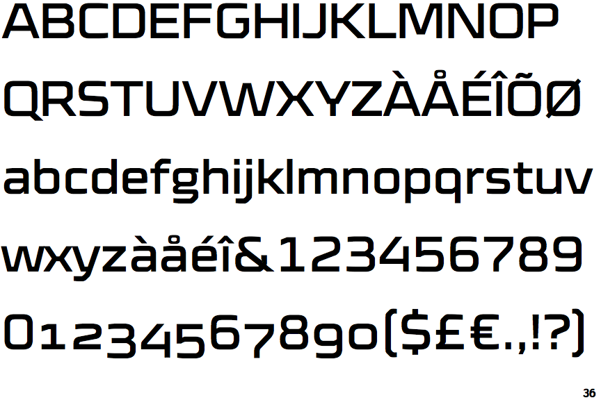
The '$' (dollar) has a single line which does not cross the 'S'.
|
 |
The '&' (ampersand) is traditional style with a gap at the top.
|
 |
The diagonal strokes of the upper-case 'K' connect to the vertical via a horizontal bar.
|
 |
The centre vertex of the upper-case 'M' is above the baseline.
|
 |
The 'l' (lower-case 'L') has no serifs or tail.
|
 |
The top of the lower-case 'q' has no spur or serif.
|
 |
The right side of the upper-case 'G' has a flat section.
|
 |
The tail of the upper-case 'Q' is straight (horizontal, diagonal, or vertical).
|
 |
The lower-case 'u' has a stem/serif.
|
 |
The lower storey of the lower-case 'g' has a gap.
|
There are more than ten differences; only the first ten are shown.
Note that the fonts in the icons shown above represent general examples, not necessarily the two fonts chosen for comparison.
Show Examples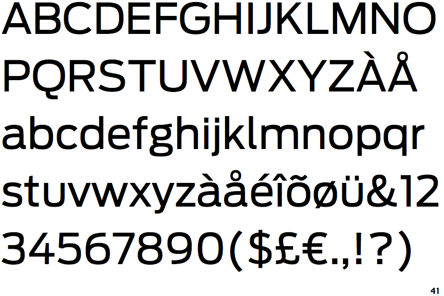
 |
The '$' (dollar) has a single line crossing the 'S'.
|
 |
The '&' (ampersand) is traditional style with two enclosed loops.
|
 |
The diagonal strokes of the upper-case 'K' meet in a 'T'.
|
 |
The centre vertex of the upper-case 'M' is on the baseline.
|
 |
The 'l' (lower-case 'L') has a right-facing lower serif or tail.
|
 |
The top of the lower-case 'q' has a vertical or slightly angled spur (pointed or flat).
|
 |
The right side of the upper-case 'G' is curved.
|
 |
The tail of the upper-case 'Q' is curved, S-shaped, or Z-shaped.
|
 |
The lower-case 'u' has no stem/serif.
|
 |
The lower storey of the lower-case 'g' has no gap.
|