Identifont

Fonts by Appearance

Fonts by Name

Fonts by Similarity

Fonts by Picture

Fonts by Designer/Publisher

Differences

TweetTweet Differences

Compare: and  

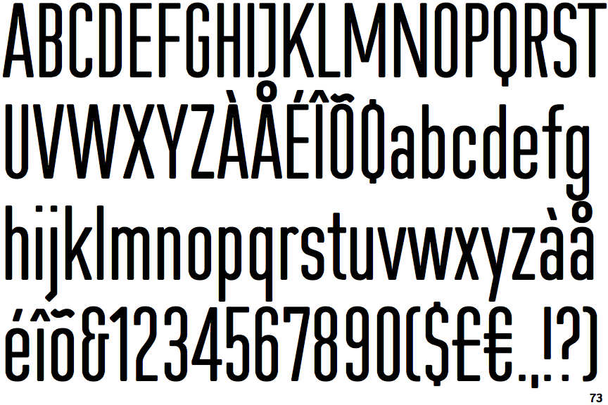
FF Cst Berlin East

FF Cst Berlin East

Gap top
The '&' (ampersand) looks like 'Et' with a gap at the top.
Above
The centre vertex of the upper-case 'M' is above the baseline.
Single-bar
The upper-case 'J' has a bar to the left.
V-shaped
The sides of the lower-case 'y' are angled (V-shaped).
Double
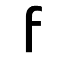
The bar of the lower-case 'f' is double-sided.

Note that the fonts in the icons shown above represent general examples, not necessarily the two fonts chosen for comparison.

Show Examples
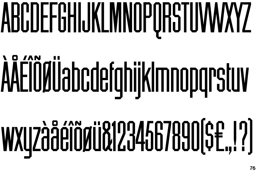
Chamfer Gothic

Chamfer Gothic

Closed
The '&' (ampersand) is traditional style with two enclosed loops.
Baseline
The centre vertex of the upper-case 'M' is on the baseline.
Plain
The upper-case 'J' has no bar.
U-shaped
The sides of the lower-case 'y' are parallel (U-shaped).
Single
The bar of the lower-case 'f' is single-sided.