 |
The top storey of the '3' is a smooth curve.
|
 |
The 'l' (lower-case 'L') has no serifs or tail.
|
 |
The upper-case 'J' has no bar.
|
 |
The upper-case 'A' has tapered verticals.
|
 |
The bar of the lower-case 'f' is single-sided.
|
 |
The upper-case letter 'I' is plain.
|
 |
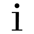
The lower-case 'i' has no serifs or tail.
|
 |
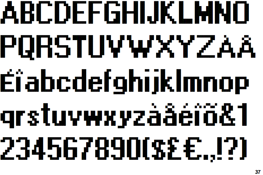
The character outlines are stepped or jagged.
|
 |
The centre strokes of the upper-case 'W' meet at a vertex.
|
Note that the fonts in the icons shown above represent general examples, not necessarily the two fonts chosen for comparison.
Show Examples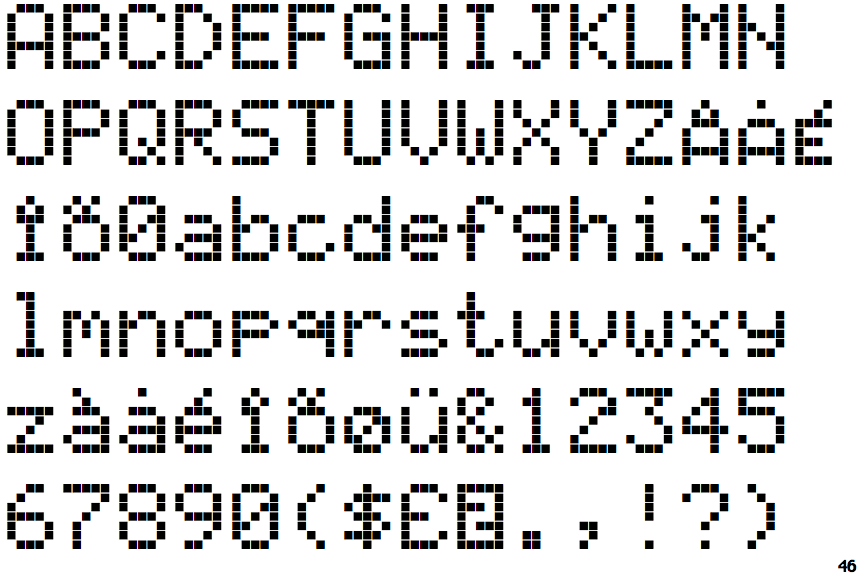
 |
The top storey of the '3' is a sharp angle.
|
 |
The 'l' (lower-case 'L') has a left-facing upper serif and double lower serifs.
|
 |
The upper-case 'J' has a bar both sides.
|
 |
The upper-case 'A' has parallel verticals.
|
 |
The bar of the lower-case 'f' is double-sided.
|
 |
The upper-case letter 'I' has serifs/bars.
|
 |
The lower-case 'i' has a left-facing upper serif and double lower serifs.
|
 |
The character outlines are smooth/sharp.
|
 |
The centre strokes of the upper-case 'W' form one centre stroke.
|