Identifont

Fonts by Appearance

Fonts by Name

Fonts by Similarity

Fonts by Picture

Fonts by Designer/Publisher

Differences

TweetTweet Differences

Compare: and  

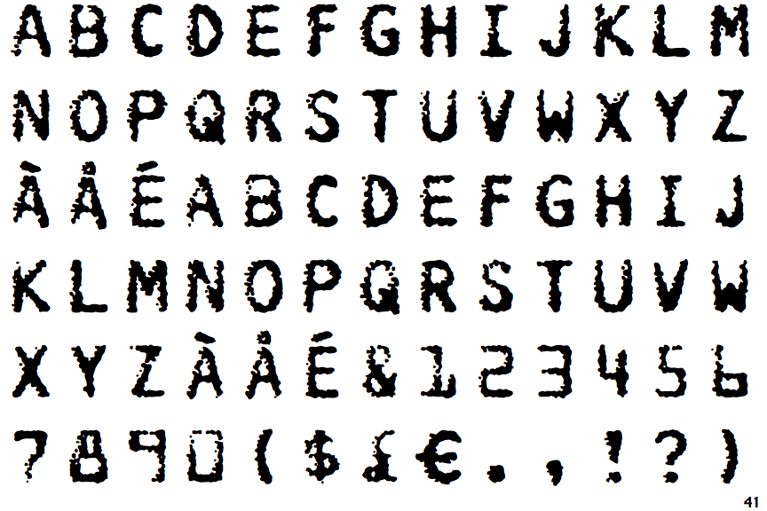
FF Burokrat Two

FF Burokrat Two

Crosses
The upper-case 'Q' tail crosses the circle.
Above
The centre vertex of the upper-case 'M' is above the baseline.
Parallel
The verticals of the upper-case 'M' are parallel.
Normal
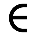
The upper-case 'E' is normal letter shape.
Serifs
The upper-case letter 'I' has serifs/bars.

Note that the fonts in the icons shown above represent general examples, not necessarily the two fonts chosen for comparison.

Show Examples
ITC Farmhaus

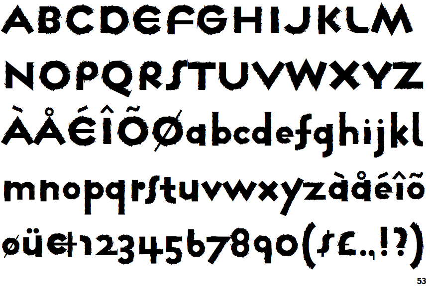
ITC Farmhaus

Touches
The upper-case 'Q' tail touches the circle.
Baseline
The centre vertex of the upper-case 'M' is on the baseline.
Sloping
The verticals of the upper-case 'M' are sloping.
C-bar
The upper-case 'E' is drawn as a 'C' with a bar.
Plain
The upper-case letter 'I' is plain.