Identifont

Fonts by Appearance

Fonts by Name

Fonts by Similarity

Fonts by Picture

Fonts by Designer/Publisher

Differences

TweetTweet Differences

Compare: and  

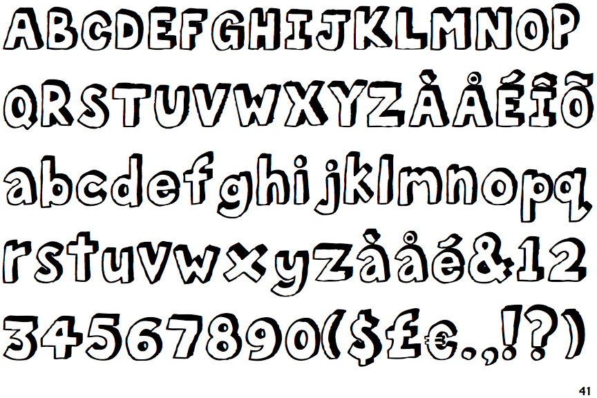
FF Bokka Shadow

FF Bokka Shadow

Above
The centre vertex of the upper-case 'M' is above the baseline.
Parallel
The verticals of the upper-case 'M' are parallel.
Angled
The top storey of the '3' is a sharp angle.
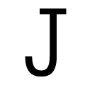
Double-bar
The upper-case 'J' has a bar both sides.
U-shaped
The sides of the lower-case 'y' are parallel (U-shaped).
Serifs
The upper-case letter 'I' has serifs/bars.

Note that the fonts in the icons shown above represent general examples, not necessarily the two fonts chosen for comparison.

Show Examples
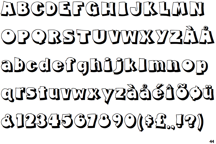
Fumo Dropshadow

Fumo Dropshadow

Baseline
The centre vertex of the upper-case 'M' is on the baseline.
Sloping
The verticals of the upper-case 'M' are sloping.
Round
The top storey of the '3' is a smooth curve.
Plain
The upper-case 'J' has no bar.
V-shaped
The sides of the lower-case 'y' are angled (V-shaped).
Plain
The upper-case letter 'I' is plain.