Identifont

Fonts by Appearance

Fonts by Name

Fonts by Similarity

Fonts by Picture

Fonts by Designer/Publisher

Differences

TweetTweet Differences

Compare: and  

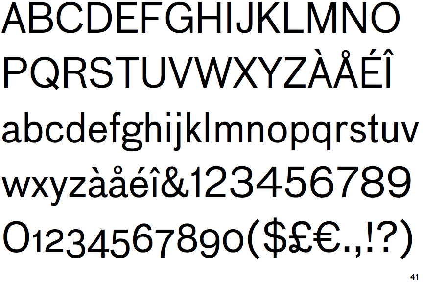
FF Bau

FF Bau

Baseline
The centre vertex of the upper-case 'M' is on the baseline.
Round
The top storey of the '3' is a smooth curve.
2-Storey
The lower-case 'g' is double-storey (with or without gap).
Spur
The upper-case 'G' has a spur/tail.
Outwards
The leg of the upper-case 'R' is curved outwards.
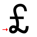
£ with loop
The foot of the '£' (pound) has a loop.

Note that the fonts in the icons shown above represent general examples, not necessarily the two fonts chosen for comparison.

Show Examples
Gotham

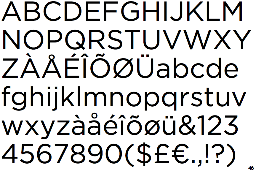
Gotham

Above
The centre vertex of the upper-case 'M' is above the baseline.
Angled
The top storey of the '3' is a sharp angle.
1-Storey
The lower-case 'g' is single-storey (with or without loop).
No spur
The upper-case 'G' has no spur/tail.
Straight
The leg of the upper-case 'R' is straight.
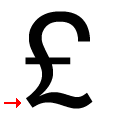
£ no loop
The foot of the '£' (pound) has no loop.